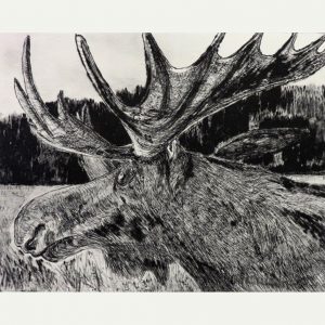
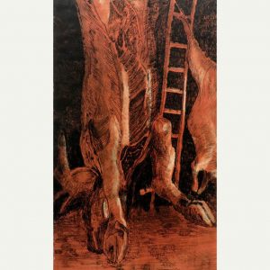
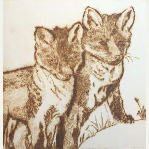
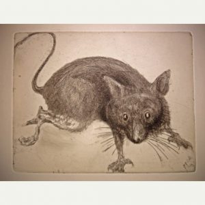
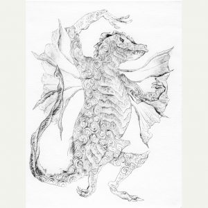
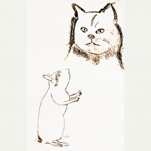
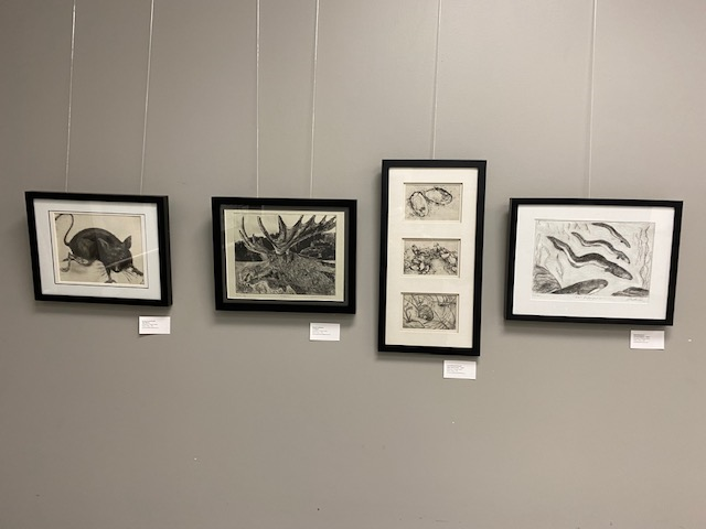
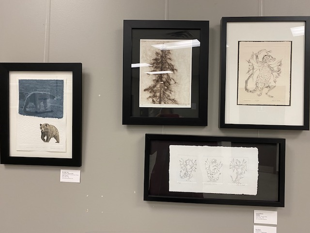
A collaboration between OGPC and the Mahone Bay Printmakers, Waterworks on Paper is now on view at the Connective Gallery. Originally exhibited in April 2021 at the Lunenburg Art Gallery in Nova Scotia, , the show was never seen in Ottawa because of pandemic restrictions. Now, finally, we can enjoy Waterworks both in person and online. The 22 prints demonstrate a variety of approaches to the theme of water, from figurative to abstract works, and from mezzotint to etching, relief and photogravure.
Participating artists from OGPC are Mary Baranowski-Lowden, Sylvia Bretzloff, Valerie Bridgeman, Susan Cartwright, Peter Dolan, Deidre Hierlihy, Rob Hinchley, Freida Hjartarson, Shealagh Pope, Katherine Stauble and Roger Sutcliffe.
Eau, source d’imagerie: Exposition et échange d’estampes
Fruit d’une collaboration entre le CAGOG et le Mahone Bay Printmakers, Eau, source d’imagerie est maintenant à l’affiche à la Galerie du Collectif. Apparue pour la première fois en avril 2021 à la Lunenburg Art Gallery en Nouvelle-Écosse, l’exposition n’a jamais été présentée à Ottawa en raison des restrictions liées à la pandémie. Maintenant, nous pouvons enfin apprécier Eau, source d’imagerie en personne et en ligne. Les 22 estampes illustrent une variété d’approches du thème de l’eau, allant des œuvres figuratives aux œuvres abstraites, et de la manière noire à l’eau-forte, au relief et à la photogravure.
Les artistes participants du CAGOG sont Mary Baranowski-Lowden, Sylvia Bretzloff, Valerie Bridgeman, Susan Cartwright, Peter Dolan, Deidre Hierlihy, Rob Hinchley, Freida Hjartarson, Shealagh Pope, Katherine Stauble et Roger Sutcliffe.
Pour voir “Eau, source d’imagerie” en ligne consultez notre blog!
Ce projet est dédié à Ed Porter, artiste, marin, gentilhomme, professeur émérite de l’Université NSCAD et fondateur du Mahone Bay Printmakers.
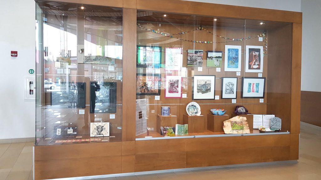
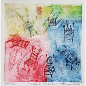
Sixteen OGPC members created original works rooted in print art while nurturing a curiosity for the creative possibilities offered by the reuse of discard, rejected or simply thrown away materials and objects. The artists have enjoyed experimenting and expanding their skills in the world of salvaging and reusing the object to keep it relevant and alive. Twenty-seven 2D and 3D original artworks are on display until May 30th, in the Atrium Showcase. Shenkman Arts Centre 245 Centrum Blvd., Orleans.
Participating artists: Luigina Baratto, Valerie Bridgeman, Susan MW Cartwright, Murray Dineen, Carol Howard Donati, Deidre Hierlihy, Freida Hjartarson, Denise Lachance, Aileen Leo, Pamela Levac, Tina Petrovicz, Shealagh Pope, Rod Restivo, Madeleine Rousseau, Beth Shepherd and Roger Sutcliffe. Guest curator is Madeleine Rousseau.
We are hoping to hold a Meet the Artists event on April 3! Keep the date! More info to come…
Réutilisation créative en arts imprimés
Les 16 membres de CAGOG ont créé des oeuvres originales bien ancrées dans les arts imprimés tout en alimentant en curiosité pour les possiblités créatives offertes par la réutilation de matériaux et d’objets usagés, délaissés, rejetés out tout bonnement mis à la poubelle. Les artists ont pris plaisir à expérimenter et étendre leur savior-faire à l’univers de la récupération et de la réutilisation de l’objet pour le maintenir pertinent et vivant. Vingt-sept œuvres d’art originales en 2D et 3D sont exposées jusqu’au 30 mai, dans la vitrine de l’Atrium. Centre des arts Shenkman 245, boulevard Centrum, Orléans.
Artistes participants: Luigina Baratto, Valerie Bridgeman, Susan MW Cartwright, Murray Dineen, Carol Howard Donati, Deidre Hierlihy, Freida Hjartarson, Denise Lachance, Aileen Leo, Pamela Levac, Tina Petrovicz, Shealagh Pope, Rod Restivo, Madeleine Rousseau, Beth Shepherd and Roger Sutcliffe. Commissaire invitée est Madeleine Rousseau.
Nous espérons organiser une rencontre avec les artistes le 3 avril! Gardez la date! Plus d’informations à venir…
We have a new bilingual glossary of Printmaking techniques that members Beth Shepherd and Madeleine Rousseau have worked hard to put together. In conjunction with the glossary, they also created a large poster that will be installed at the OGPC Gallery at the Nepean Creative Arts Centre.
Want to learn more about what does linocut or etching mean? OR what are all the different kinds of traditional printmaking types? Visit our webpage The Art of Print – Printmaking Techniques !
Un nouveau glossaire bilingue des techniques des arts imprimés est maintenant disponible. Ce projet a été piloté laborieusement par Beth Shepherd et Madeleine Rousseau, deux membres du CAGOG. De plus, elles ont créé une grande affiche qui vulgarise les techniques des arts imprimés. Cette affiche sera placée dans la Galerie du CAGOG située dans le Centre des arts créatifs de Nepean.
Vous voulez en savoir plus sur ce qu’est la linogravure ou l’eau-forte ? Ou quelles sont les différentes techniques d’arts imprimés traditionnelles ? Visitez notre page web L’art de l’estampe- Techniques des arts imprimés!
We live in a world where images can be mass reproduced without end. We can trace this history back to the printing press through to the industrial revolution. In response to the growing mass production of printed images, visual artists in the late 19th century revived the creation of the handmade drypoint.
Artists used a stylus to scratch lines directly into a soft metal plate, typically copper. A delicate burr would be raised from the plate. Both the incised line and the burr will hold ink when the plate is wiped. It is this highly coveted burr that creates the velvety soft lines and plate tone that is sought by visual artists using drypoint.
Today, the traditional drypoint technique is still popular with artists. In the last few years, there has been an explosion in experimentation with different surfaces and tools. Dentistry tools, nails and power drills can be used to create lines and textures on various types of flat matrices, such as PVC, plexiglass, PETG packaging plastic and even flattened Tetra packs and plywood. As a result of such experimentation, drypoint and printmaking in general are now more accessible to new and established visual artists.
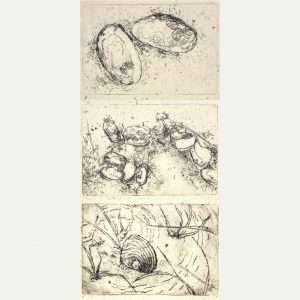
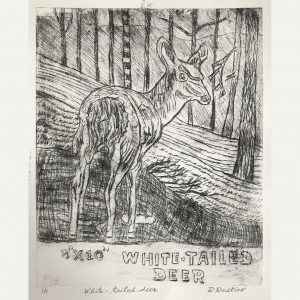
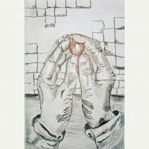
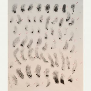
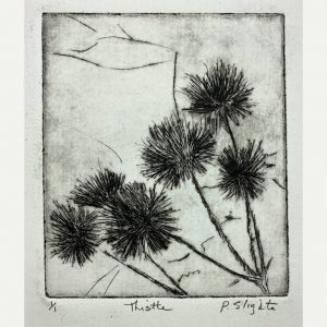
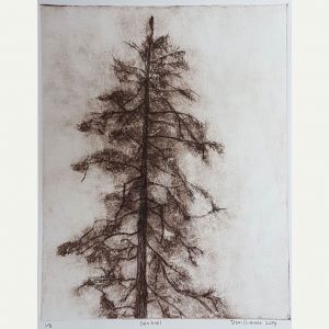
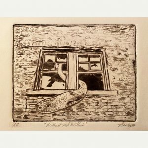
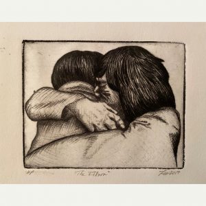
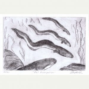
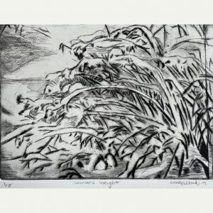
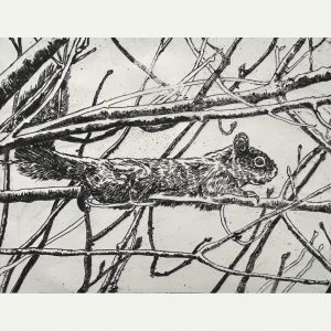
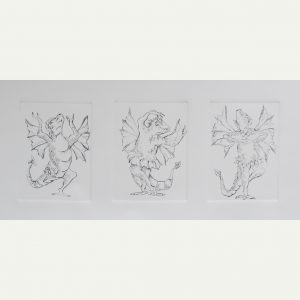
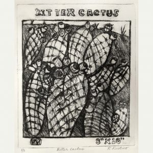
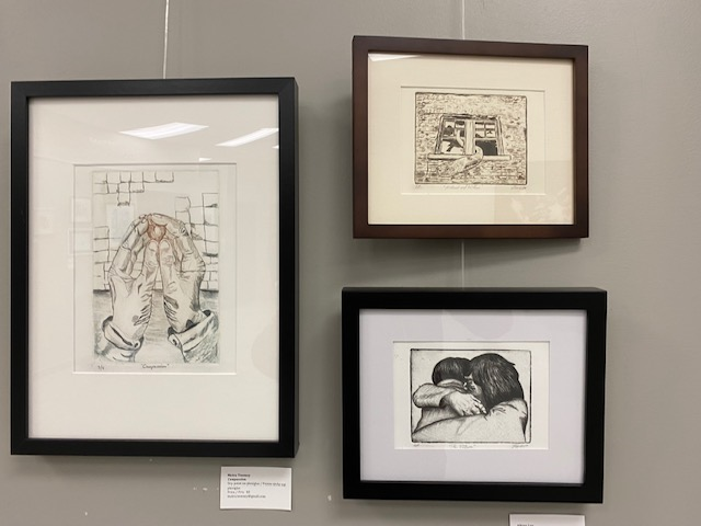
Our current show “Feel the Burr” features a full range of works featuring drypoint, from simple line drawings to works demonstrating a variety of mark making and values shaping the form. While drypoints traditionally are dark ink on white paper, we showcase works that incorporate colour, through the use of coloured inks, multiple plates or the application of coloured paper in a manner know as chine-collé. Because the burr on the plate can quickly break down under the weight of the press, editions are usually very small. Many of the pieces in Feel the Burr are unique prints.
Nous vivons dans un monde où les images peuvent être reproduites en masse sans fin. Nous pouvons retracer cette histoire à l’invention de l’imprimerie jusqu’à la révolution industrielle. En réponse à la production de masse croissante des images imprimées, les artistes visuels à la fin du 19ème siècle ont relancé la création de la pointe sèche faite à la main.
Les artistes utilisaient un stylet pour rayer les lignes directement dans une matrice de métal tendre, généralement du cuivre. Une fine bavure, ou barbe, serait soulevée de la matrice. La ligne incisée et la barbe retiendront l’encre lorsque la matrice est essuyée. C’est cette barbe très convoitée qui crée les lignes douces et veloutées et la tonalité de la plaque recherchées par les artistes visuels utilisant la pointe sèche.
Aujourd’hui, la technique traditionnelle des pointes sèches est toujours populaire auprès des artistes. Au cours des dernières années, il y a eu une explosion d’expérimentation avec différentes matrices et différents outils. Des outils de dentisterie, des clous et des perceuses électriques peuvent être utilisés pour créer des lignes creux? et des textures sur différents types de matrices plates, comme le PVC, le plexiglas, le plastique d’emballage PETG et même les emballages Tetra aplatis et le contreplaqué. À la suite de ces expériences, la création à la pointe sèche et les arts imprimés en général sont maintenant plus accessibles aux artistes visuels émergents et établis.
Notre exposition actuelle «Touchez les barbes!» présente une gamme complète d’œuvres créées avec la technique de la pointe sèche, allant de simples dessins linéaires à des œuvres déployant une variété de marques et de tonalités? qui façonnent la forme. Alors que les œuvres à la pointe sèche sont traditionnellement réalisées avecde l’encre foncée sur papier blanc, nous présentons des œuvres qui incorporent la couleur, par l’utilisation d’encres colorées, de plaques multiples ou l’application de papier coloré d’une manière appelée chine collé. Parce que la barbe sur la plaque peut rapidement se décomposer sous le poids de la presse, les tirages? sont généralement très petits. Un bon nombre des estampes de «Touchez les barbes!» sont des mono impressions.
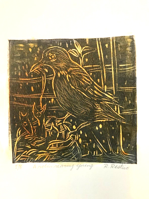
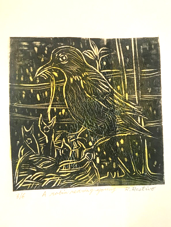
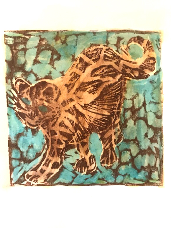
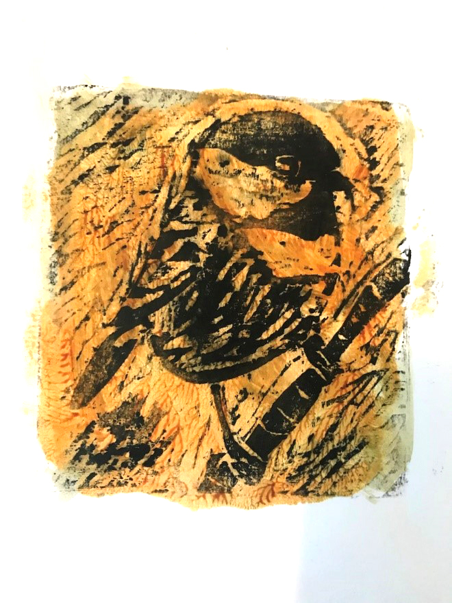
Exhibiting Artists (not in order of appearance) / Les artists exposants (pas dans l’ordre d’apparition): Luigina Baratto, Cheryl Beillard, Susan MW Cartwright, Murray Dineen, Carol Howard Donati, Leonard Gerbrandt, Denise Lachance, Aileen Leo, Shealagh Pope, Rod Restivo, Madeleine Rousseau, Beth Shepherd, Patricia Slighte, Dale Shutt, Moira Toomey, and/ et Doug Williams.
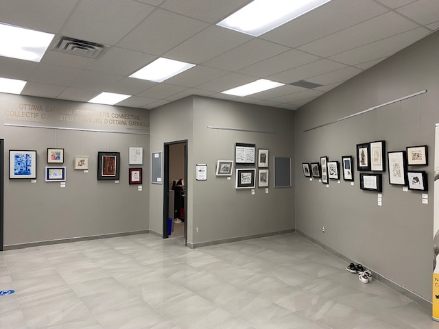
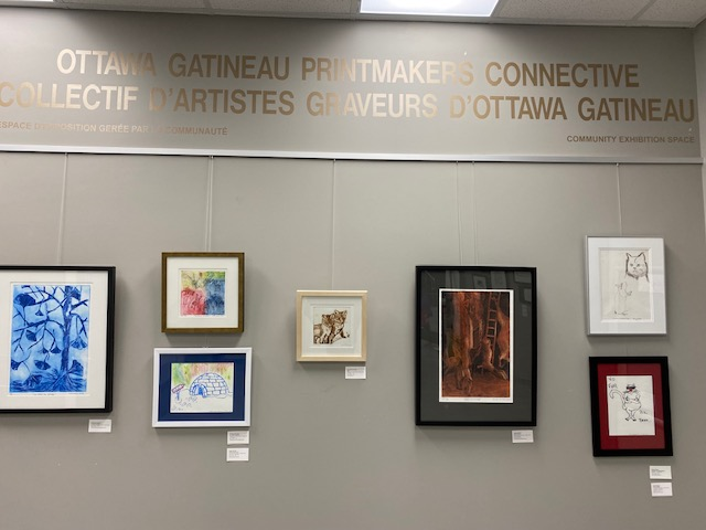
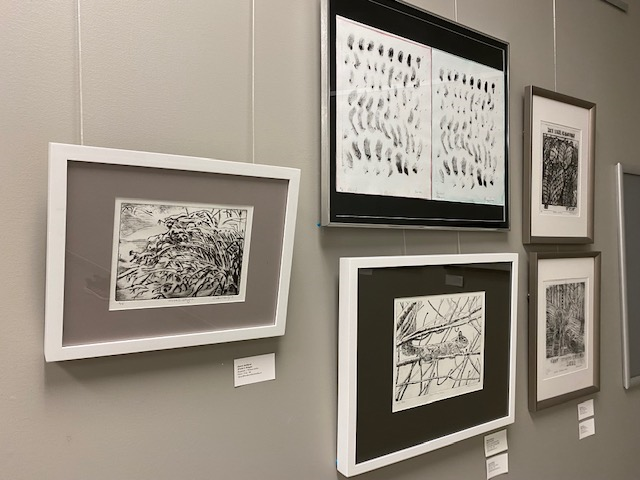
Click on the artwork to have more information and see a close-up view./ Cliquez sur l’œuvre d’art pour avoir plus d’informations et voir un gros plan.
Traditionally, encaustic printmaking made use of coloured beeswax heated on an aluminum sheet placed on a hotplate in order to make an image. Printmakers can provide a sort of encaustic finish look to their prints with the following procedures I experimented with. This will produce a monoprint.
The following procedures using acrylic mediums can recreate this encaustic wax appearance. It should be noted at the outset that use will be made of Golden Open acrylics and mediums that remain moist for an extended time and are thus suitable for monoprinting. They can be mixed with Golden heavy body acrylics and mediums if one wants to speed up the drying time.
1) The most straight-forward approach will be to use Golden heavy gel (matte) mixed with Golden Open acrylic medium (gloss) in a ratio of 1:3, respectively. As noted above, the monoprint technique that is to follow uses Golden Open acrylic medium since the heavy gel on its own would dry too quickly.
The back of a clear acrylic plate will have an outline of the print image traced onto it. The above-mentioned mediums are brushed onto the top of this acrylic plate using a bristle brush or scraped on with a plastic palette knife. The mediums should be applied in a thin layer. A second layer can always be added after the print has partially dried.
To give a wax-like appearance, a few drops of Golden fluid acrylic quinacridone/nickel azo gold is applied and mixed with the mediums. Other modern acrylics can also be added such as phthalo blue (green shade), indian yellow hue (quinacridone/nickel azo yellow/arylide yellow) or naphthol red light (see examples in photos) .
For registration purposes, the acrylic plate coated with mediums can be laid on top of the print. The mediums are transferred onto the print using hand pressure. The print and the acrylic plate can be turned over, so that the print lies on top of the acrylic plate and further hand pressure or hand burnishers can be applied.
2) Alternatively, to create a yellow acrylic wax-like appearance, add a couple of drops of Golden fluid Hansa yellow medium and quinacridone/nickel azo gold to Golden soft gel (semi-gloss) with a few drops of Golden acrylic glazing liquid (gloss). This gives a wax-like surface with the viscosity of yogurt and the colour of warm liquid beeswax. The transfer process is the same as the original method.
3) The best procedure for acrylic encaustic printmaking is to thinly brush (or scrape with a plastic palette or a small strip of plexiglass) Golden Open acrylic gel (matte) onto a clear acrylic sheet. You may add 4 drops of Open acrylic medium (gloss) in order to create a mixture of gloss and matte finish. Add 4 drops of Golden fluid Indian yellow hue and 3 drops of quinacridone/nickel azo gold and mix the mediums and acrylics. The printing process is the same as the original.
Here are examples of acrylic encaustic printmaking showing prints with different colors of the medium-gel mix.
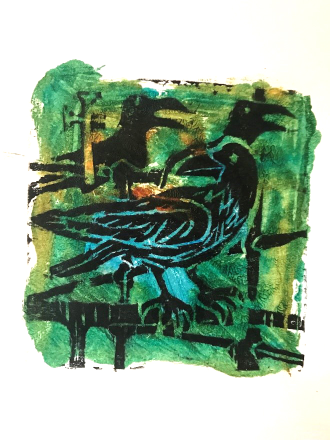
The Ottawa-Gatineau Printmakers Connective is pleased to present its’ exhibition “Drypoint Prints: Feel the Burr!” at the Nepean Creative Arts Centre in Bells Corners. Drypoint is a printmaking technique whereby the image is scratched into the surface of a plate, making a line and a distinctive burr. Thanks to Denise Lachance, our guest curator, and all the members who helped in various capacities. The exhibit will be on display from Nov 4, 2021 to Mar 3, 2022. It is recommended that you call the NCAC at 613-596-5783 to confirm gallery hours and COVID requirements.
Nouvelle exposition à la galerie Connective– « Touchez les barbes! »
Le Collectif d’artistes-graveurs d’Ottawa-Gatineau a le plaisir de présenter son exposition d’arts imprimés en pointe sèche « Touchez les barbes » au Centre des arts créatifs à Bells Corners. La gravure à la pointe sèche est une technique par laquelle l’image est rayée dans la surface d’une plaque, faisant une ligne et soulevant une barbe abondante. Merci à Denise Lachance, notre conservatrice invitée, et à tous les membres qui ont aidé à divers titres. L’exposition sera présentée du 4 novembre 2021 au 3 mars 2022. Il est recommandé d’appeler le Centre au 613-596-5783 afin de confirmer les heures d’ouverture de la galerie et les exigences COVID.
Participating printmaking artists: / Les artistes-graveurs participants(es) : Luigina Baratto, Cheryl Beillard, Susan MW Cartwright, Murray Dineen, Carol Howard Donati, Leonard Gerbrandt, Denise Lachance, Aileen Leo, Shealagh Pope, Rod Restivo, Madeleine Rousseau, Beth Shepherd, Patricia Slighte, Dale Shutt, Moira Toomey, and/ et Doug Williams.
Driven by biology and powerful narratives, humans have transformed and dominated Earth like no other species. This exhibition titled “It’s the Economy” examines, in the context of the Anthropocene, the paradigm of economic growth, mass production, and mass consumption.
Shirley Yik is an Ottawa artist whose practice includes printmaking, drawing and painting. Her work explores human-created systems in relations to the Anthropocene and our societal values. She holds a Diploma of Fine Arts from the Ottawa School of Art, Master degrees in Management Studies and Information Systems Science at Carleton University.
The artist gratefully acknowledges the support of the City of Ottawa and the Ontario Arts Council.
Encouragés par leur biologie et de puissants narratifs, les humains ont transformé et dominé la Terre comme aucune autre espèce. Cette exposition intitulée «C’est l’Économie» examine, dans le contexte de l’Anthropocène, le paradigme de la croissance économique, de la production de masse et de la consommation de masse.
Shirley Yik vit à Ottawa et sa pratique artistique inclut la gravure, le dessin et la peinture. Son travail explore les systèmes créés par l’homme en rapport avec l’Anthropocène et nos valeurs sociétales. Elle est titulaire d’un diplôme en Beaux-Arts de l’École d’art d’Ottawa, de Maîtrises en études de gestion et science des systèmes d’information de l’Université de Carleton.
L’artiste tient à remercier vivement pour leur support la Ville d’Ottawa, le Conseil des Arts de l’Ontario et le Centre des arts Shenkman.
L’entrée est gratuite. Un masque, une distance physique et une preuve de vaccination sont requis. https://shenkmanarts.ca/updates
Why would you want to pre-mix a green hue and store it in a tube? Is it not easier to just mix yellow and blue on your palette and hope for the best? However, if you want a consistent green that is pre-mixed according to a fixed formula, having a tube ready to go is very handy when you are in a hurry and you need to focus on mixing other colours.
I often wondered, why, in oil painting, every brand has a Permanent Green Light until I bought a tube and realized how handy it is to have a consistent green that I can easily lighten or darken according to need. A little more blue will turn it into permanent green medium while more yellow will give you various shades of apple green.
Apparently, there is no reason to call the colour “Permanent green”; it just started that way and no one knows why. It has nothing to do with the permanence or lightfastness of the pigments. In fact, in the case of printing inks, the yellow that is used is mostly PY3, or Hansa yellow which is listed as moderately lightfast.
For the purpose of this mixture, we will use Process yellow and Process blue from Calego Safe Wash ink. This Process yellow is listed as PY3, or Hansa yellow, a Monoazo, also called Arylide yellow. The masstone is a bright lemon yellow with a slightly greenish undertone. It is semi-transparent. It is best to avoid the Diarylide yellow as the undertone has a reddish tint. Hansa yellow is a synthetic organic pigment. Organic yellow pigments tend to be less lightfast than non-organic pigments such as the cadmium yellows. The Process blue used in the mixture is phthalocyanine blue or PB15:3, which has a deep blue in mass tone with a greenish blue in shades. The phthalocyanine family of pigments has good lightfastness, but dulls over considerable time.
So here’s an easy way to make a tube of your own permanent green. In the post Transfering ink we saw how easy it is to fill an empty tube with ink.
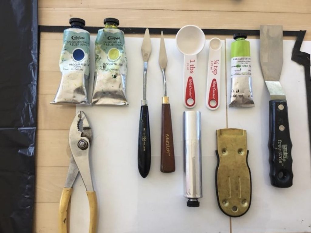
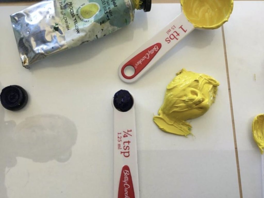
Fig. 1
So let’s start … you will need (Fig. 1) :
One tube of process yellow
One tube of process blue
A glass plate
A large palette knife
A small palette knife
One tablespoon (for use with the yellow)
One 1/8 teaspoon (or 1/4 tsp for the blue if you wish to double the recipe)
One 37 ml tube
A pair of pliers
Recipe:
You will use a larger amount of process yellow and a much smaller amount of process blue. You want to achieve a middle to light green, not too light but certainly not too dark. It is much easier to darken a color later on than to try to light it. So decide what shade of green would be suitable. A good idea is to use a tube of permanent green from a reputable brand in oil paint and try to match it.
My recipe was the following: ( I doubled the recipe to fill the 37 ml tube). These proportions are approximate and may vary according to the brand of ink that you are using.
1 tablespoon of process yellow
1/8 teaspoon of process blue
Instructions:
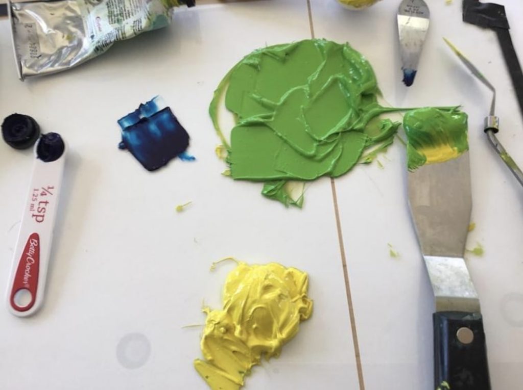
Spread the yellow on a glass plate (Fig. 2). Work the ink until it is soft. Start adding the process blue, slowly until you get the desired hue. Compare that with the permanent green light in oil paint. I used the Seymour Wallace Permanent green light fine oil purchased from Select Fine Arts on St Joseph Blvd in Orléans to get a match. If your green is too dark, as in Fig. 3, just add more yellow.
Fig. 2Fig. 3
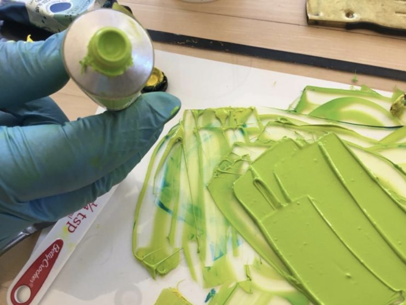
You may want to do only one recipe and fill only half the tube, depending on your needs. Start filling your empty tube using the hints from post Transferring Ink. Loosen the cap and tap down to get the ink flowing. Stop around 2/3 full and start pressing down on bottom end. Use pliers to pinch the ends together. Fold the ends twice.
Fig. 4Fig. 5
You will now have a nice tube of permanent green. (Fig. 4) When you want it lighter on your palette, it is then easy to add some yellow; if you want it darker, just add a touch of blue. Fig. 5 shows the home-made green and the Seymour Wallace Permanent green.
Why would you want to make your own ink? Here are a few reasons.
You are looking for a particular colour that is not available in your regular brand of ink.
You use large quantities of certain colours like black or white and it may be practical to make a few large tubes.
In times such as a lock-down in England, certain colours may be out of stock in Canada but pigments are always in stock at Kama Pigments in Montreal.
You are inquisitive about colour and oil absorbency and you like to experiment.
There are a few things to know before you start:
Pigment structure
The crystalline or chemical structure of a pigment will determine its particular shape, size and colour.
Because of their crystalline structure different pigments will absorb different amounts of oil.
As a result of these factors some pigments will require different amounts of oil and will take longer to mill than others.
Pigments are agglomerations of primary particles that can be separated into a dispersion using a muller and an oil binder. Some particles require more oil to completely wet and coat their surface while others require less oil. The quantity of oil necessary is mostly determined by the shape and size of the pigment particle. For example, the cadmium pigment is round and relatively smooth; the alizarin crimson has a more nodular grape-like structure and the ultramarine pigment is more spherical and uneven. Since the milling process calls for the complete coating of every particle, it follows that a particle which is round and smooth would require less oil than one with a nodular or uneven shape. This is what determines the oil-absorption rate. (See below). In the case of pigments, size does matter. The smaller the size of the particle, the larger the overall surface area that needs to be coated with oil in a given volume or weight.
Some may ask if the amount of oil in a given mixture determines the drying time. For example, the burnt umber pigment requires significantly more oil than the titanium pigment in the milling process. (Oil painters have a problem with burnt umber as it creates an issue with the fat over lean principal. This problem is created by the extra oil necessary in the production of this colour.) However, this is not an issue in the case of printing; there is no correlation between the amount of oil that a pigment requires and the drying time. In fact, it is often the opposite. We all know that burnt umber dries quickly while titanium dries slowly.
Oil-absorption-rate
The oil-absorption-rate is measured by the ratio of both pigment (by weight) to oil (by weight). As an aside, there is currently a debate as to whether the measure should be by weight or by volume, but that discussion is for another day. The standard unit of measure for the US is in ounces. For example the quinacridone magenta which we will be mulling would require 100 ounces in linseed oil (by weight) to grind 40-65 ounces of pigment (by weight) to form a stiff paste. The oil-absorption-rate indicates whether the paste contains more or less oil and how its oil content compares with that of other pigment pastes.
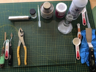
Tools (fig.1)
Dry pigment (in this case, Quinacridone Magenta PR122)
A glass muller
Thick plate glass (I use a 6mm thickness)
Linseed oil. I used the Caligo Safe Wash Oil.
Magnesium carbonate (MgCo2)
A wetting agent such as oxgall or isopropyl alcohol
Spatulas, one large, one small
37ml tube
Pliers
Tablespoon
Dropper
Figure 1
Recipe for Magenta PR122.
A good approximation to fill a 37ml tube would be 3 tablespoons of dry pigment.
Linseed oil (see ratio quoted above)
Approximately 1/16 to 1/8 teaspoon MgCo2 per tablespoon of dry pigment.
Note: It’s a good idea to mix one tablespoon of pigment at a time. Also, if the paste is too stiff it is because too much magnesium carbonate was added. You will notice this when comes the time to clean the tools as the paste will tend to stick to the tools. Then all you need to do is add a few drops of oil when comes the time to use the paste. It is easier to add oil to a stiff paste than to add the magnesium carbonate if the paste is too oily.
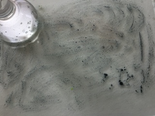
Preparation of muller and glass plate.
The glass muller comes with a rough flat bottom but needs to be made even rougher. Also, the glass plate needs to be sandedso that it is slightly pitted. The muller comes (if purchased from Kama Pigments) with an 80 grit silicon carbide. Spread this grit on the glass plate and add water. Take the muller and rub it against the grit on the glass plate. (It does make an awful noise). This will roughen both the muller and the glass and will create resistance as the pigment mixture is mulled against the glass. (Fig.2)
Figure 2
Figure 3
Instructions
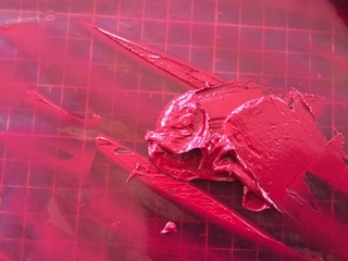
Measure the dry pigment on the glass plate (fig.3). With a dropper, start adding a wetting agent such as oxgall or alcohol to the dry pigment; using a small spatula work the mixture until all the pigments and wetting agent form a paste (fig.4). This step is important in order to break the surface tension of the pigment particles and to allow the particles to better absorb the oil.
Slowly start adding the oil to the paste. I use a dropper for this. At this point, start using a large spatula and start working the mixture carefully blending the oil into the paste. The idea is to obtain a smooth paste. Continue adding oil until the mixture is easily spreadable but not too oily. (Fig. 5).
Figure 4
Figure 5
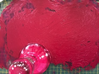
At this point, spread the mixture on the glass plate and start using the muller. Push the muller firmly on the glass plate using a circular movement in the shape of an 8 (fig. 6). Do this for approximately 20 minutes, adding oil if necessary. The bottom part of the muller will gather the mixture along its edges; using the small spatula, remove this paste and reintegrate it to the mixture on the plate. You also need to take the large spatula and frequently gather the mixture which has by now spread over the surface of the glass plate and reposition it in the middle of the plate. Start the process all over again until you feel that the mixture is nice and smooth with no visible dry pigment. The time necessary for a perfectly milled mixture is a function of the shape and size of the particle as explained above.
Figure 6
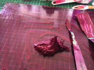
At this point you can set the muller aside after removing all paste underneath and along its edges. Now is the time to start adding the magnesium carbonate. The magnesium carbonate will make the ink sticky so you only need small quantities. Otherwise you will find that it is very difficult to wash off as it sticks to all the tools. You will be using a small spatula to mix the carbonate into the paste. Work it in well. You want a peak but not a stiff peak (fig.7). Your ink is now ready.
Figure 7
Start filling the tube with a small spatula. Hold the tube vertically, with the cap down and slightly unscrewed, As you fill the tube, you need to wrap your fingers around the tube and delicately make a downward movement, hitting a table with the bottom part of your hand so that the ink starts moving down the tube. Try not to tap down on the cap; you don’t want to damage it.
Never fill the tube to the end as you will need to leave some space to pinch the open ends together. Filling approximately 2/3 and a bit more should be about right. Pinch the open ends together using the pliers and fold the ends twice. You may want to put a piece of paper between the metal of the tube and the pliers to avoid damaging the metal.
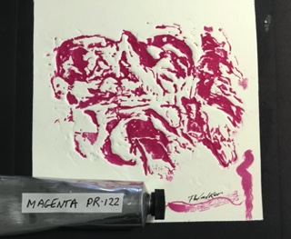
You now have a perfectly good tube of hand milled inkas used in the print (fig.8). The black border was a mixture of the magenta and phthalo green. The squiggles on the bottom right of the photo were made with the magenta heavily diluted with a plant-based diluent from Wallace Seymour which can be used to retouch a print.
Figure 8
Tools and pigment were purchased from Kama Pigments in Montreal.
The oil measurements were obtained from Ralph Mayer, The Artist’s Handbook of Materials and Techniques.
There are a few reasons why one would want to transfer ink from a can to a tube.
The hassle of opening a can and dealing with removing the numerous covers.
The ink has dried and you have to remove the top layer.
You can’t find the right colour in a small tube, like ultramarine.
You want to make your own ink and you need to store it.
The considerable cost savings in buying the larger format.
The ease in transporting tubes as opposed to cans.
Certain colours are out of stock in the smaller tubes, but available in the can.
You use a lot of certain colours, such as white, black, primary colors and of course the extender.
You want to stock up before the next pandemic in case production comes to a halt again.
Cans are messy.
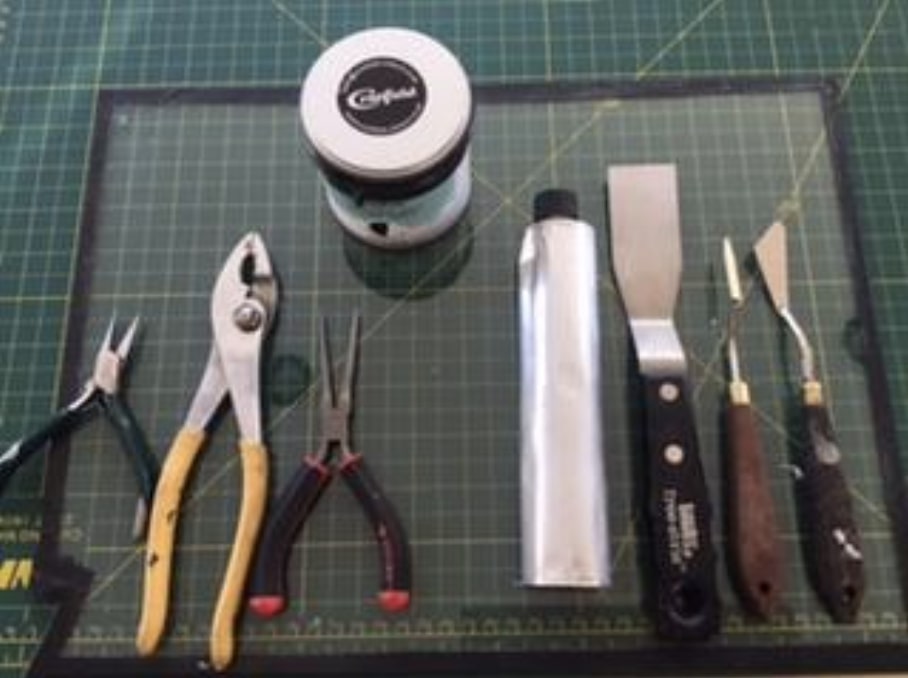
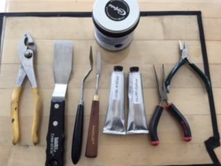
Fig. 1
Here are the tools that you need (Fig. 1). It is really easy and not messy at all.
A glass plate for the mixing
A large spatula
A rubber spatula
A smaller spatula
An empty tube (tube sizes are 37 ml and 125 ml. The tubes are available at Select Fine Arts on St Joseph Blvd in Orleans or directly from Kama Pigments in Montreal)
A pair of pliers
A good blade to clean up
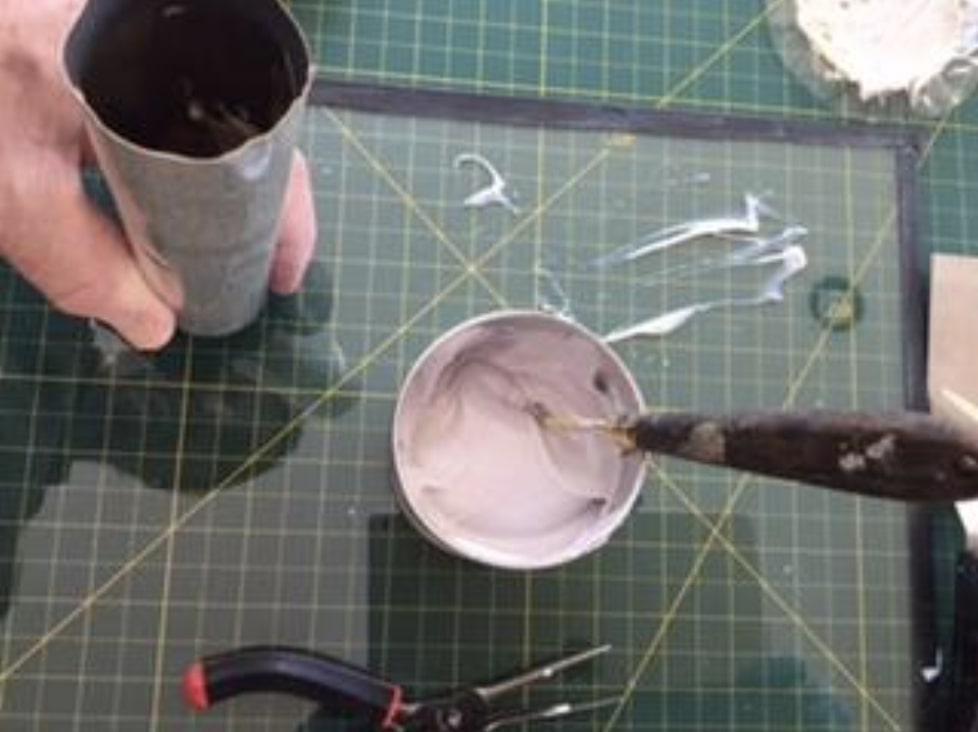
Pull out a good amount of ink from the can onto your glass plate.
Work the ink with a large spatula to soften it if it is too stiff.
Loosen the cap to allow the ink to move down the tube more easily.
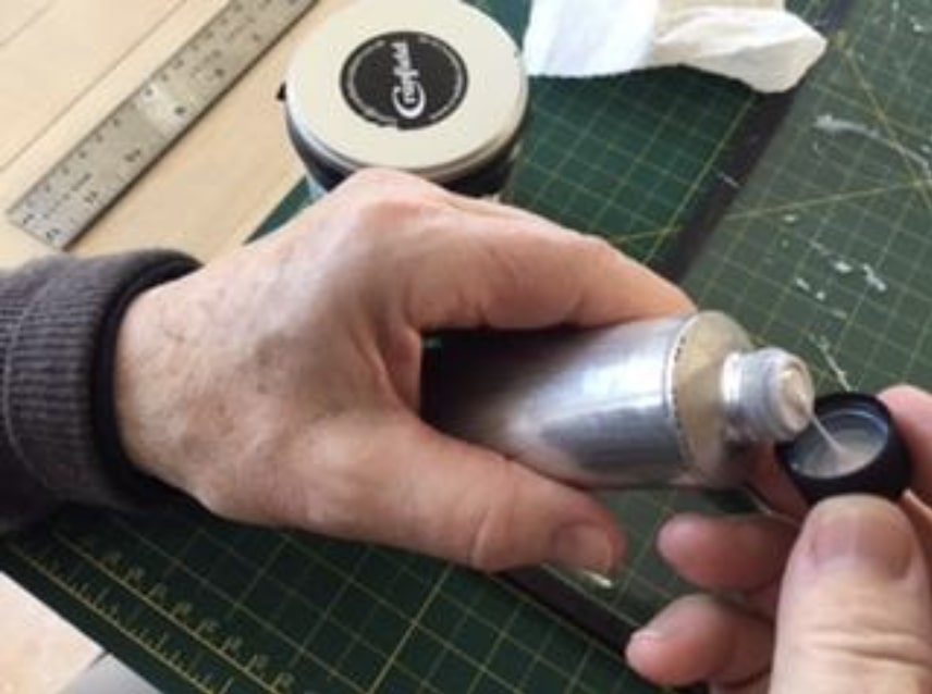
Turn the tube upside down; take the small spatula and start filling the tube (Fig. 2)
Fig. 2Fig. 3
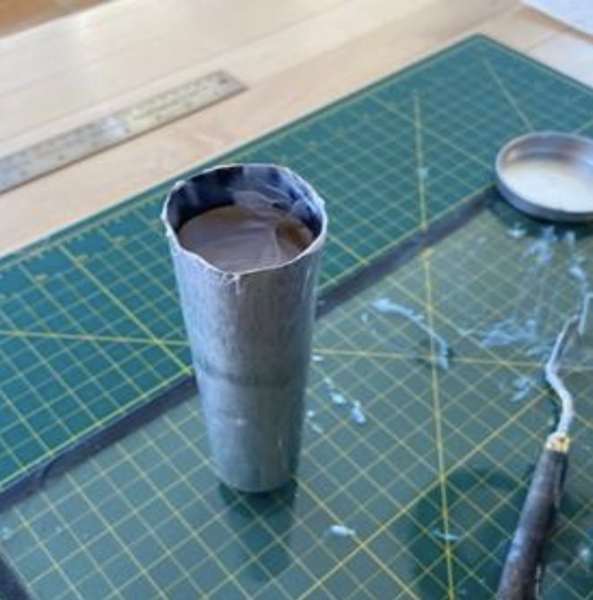
After each fill, tap the tube on the glass plate to help move the ink down the tube.
Continue filling the tube, constantly taping the cap lightly on the glass plate.
Fill the tube until it is about 2/3 full and start checking that you do not overfill (Fig. 3). You need the space towards the end to be able to shut the tube with your pliers.
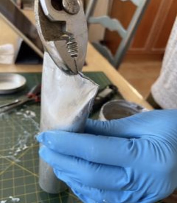
Slowly start pressing down on the last 1/3 of the tube making sure that the ink doesn’t overflow.
Take your pliers and squeeze the ends together (Fig. 4)
Fig. 4
Fold the ends twice and squeeze tight.
Take the rubber spatula and clean the inside walls of the can.
Replace the many covers on the ink in the can.
The contents of the can will fill a large 125 ml tube, with enough left over to fill a 37 ml tube (Fig. 5).