The following technical articles related to printmaking were originally published in the OGPC newsletter. The contributors are members of the Connective (except where noted) who have generously shared their experiences and findings. Their articles are included with their express permission. Please note that copyright belongs to the author of each article and that reproduction can only be made with their permission. To request permission to reproduce an article, please contact the OGPC.
Les articles techniques suivants relatifs aux arts imprimés ont été publiés à l’origine dans notre bulletin. Les collaborateurs sont des membres du Collectif (sauf indication contraire) qui partagent gracieusement leurs expériences et leurs trouvailles. Les articles inclus ici le sont avec la permission expresse des auteurs (artistes). Veuillez noter que les droits d’auteur appartiennent à l’auteur de chaque article et que tout intérêt de reproduction doit faire l’objet d’une demande à l’auteur (le contact peut se faire par le formulaire de contact.)
We have a new bilingual glossary of Printmaking techniques that members Beth Shepherd and Madeleine Rousseau have worked hard to put together. In conjunction with the glossary, they also created a large poster that will be installed at the OGPC Gallery at the Nepean Creative Arts Centre.
Want to learn more about what does linocut or etching mean? OR what are all the different kinds of traditional printmaking types? Visit our webpage The Art of Print – Printmaking Techniques !
Un nouveau glossaire bilingue des techniques des arts imprimés est maintenant disponible. Ce projet a été piloté laborieusement par Beth Shepherd et Madeleine Rousseau, deux membres du CAGOG. De plus, elles ont créé une grande affiche qui vulgarise les techniques des arts imprimés. Cette affiche sera placée dans la Galerie du CAGOG située dans le Centre des arts créatifs de Nepean.
Vous voulez en savoir plus sur ce qu’est la linogravure ou l’eau-forte ? Ou quelles sont les différentes techniques d’arts imprimés traditionnelles ? Visitez notre page web L’art de l’estampe- Techniques des arts imprimés!
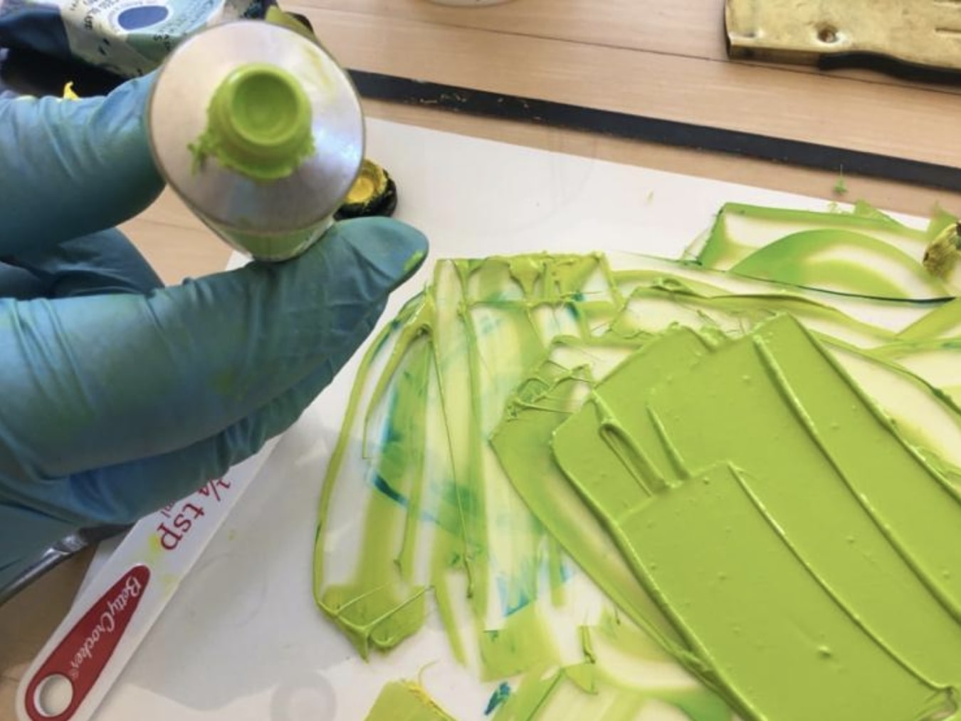
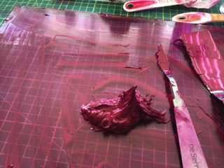
Traditionally, encaustic printmaking made use of coloured beeswax heated on an aluminum sheet placed on a hotplate in order to make an image. Printmakers can provide a sort of encaustic finish look to their prints with the following procedures I experimented with. This will produce a monoprint.
The following procedures using acrylic mediums can recreate this encaustic wax appearance. It should be noted at the outset that use will be made of Golden Open acrylics and mediums that remain moist for an extended time and are thus suitable for monoprinting. They can be mixed with Golden heavy body acrylics and mediums if one wants to speed up the drying time.
1) The most straight-forward approach will be to use Golden heavy gel (matte) mixed with Golden Open acrylic medium (gloss) in a ratio of 1:3, respectively. As noted above, the monoprint technique that is to follow uses Golden Open acrylic medium since the heavy gel on its own would dry too quickly.
The back of a clear acrylic plate will have an outline of the print image traced onto it. The above-mentioned mediums are brushed onto the top of this acrylic plate using a bristle brush or scraped on with a plastic palette knife. The mediums should be applied in a thin layer. A second layer can always be added after the print has partially dried.
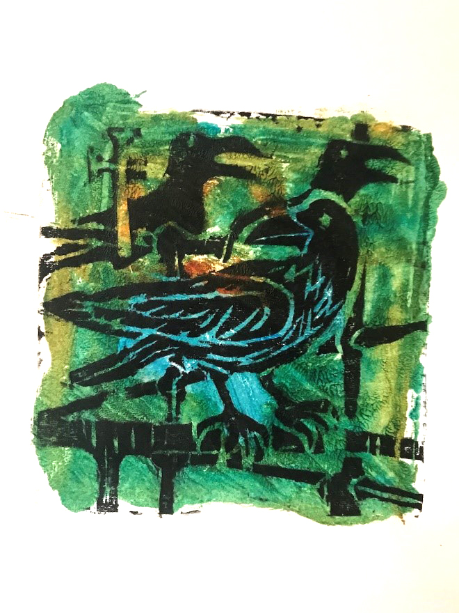
To give a wax-like appearance, a few drops of Golden fluid acrylic quinacridone/nickel azo gold is applied and mixed with the mediums. Other modern acrylics can also be added such as phthalo blue (green shade), indian yellow hue (quinacridone/nickel azo yellow/arylide yellow) or naphthol red light (see examples in photos) .
For registration purposes, the acrylic plate coated with mediums can be laid on top of the print. The mediums are transferred onto the print using hand pressure. The print and the acrylic plate can be turned over, so that the print lies on top of the acrylic plate and further hand pressure or hand burnishers can be applied.
2) Alternatively, to create a yellow acrylic wax-like appearance, add a couple of drops of Golden fluid Hansa yellow medium and quinacridone/nickel azo gold to Golden soft gel (semi-gloss) with a few drops of Golden acrylic glazing liquid (gloss). This gives a wax-like surface with the viscosity of yogurt and the colour of warm liquid beeswax. The transfer process is the same as the original method.
3) The best procedure for acrylic encaustic printmaking is to thinly brush (or scrape with a plastic palette or a small strip of plexiglass) Golden Open acrylic gel (matte) onto a clear acrylic sheet. You may add 4 drops of Open acrylic medium (gloss) in order to create a mixture of gloss and matte finish. Add 4 drops of Golden fluid Indian yellow hue and 3 drops of quinacridone/nickel azo gold and mix the mediums and acrylics. The printing process is the same as the original.
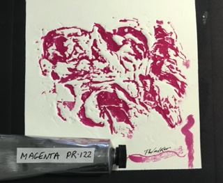
Here are examples of acrylic encaustic printmaking showing prints with different colors of the medium-gel mix.
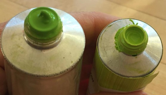
Why would you want to pre-mix a green hue and store it in a tube? Is it not easier to just mix yellow and blue on your palette and hope for the best? However, if you want a consistent green that is pre-mixed according to a fixed formula, having a tube ready to go is very handy when you are in a hurry and you need to focus on mixing other colours.
I often wondered, why, in oil painting, every brand has a Permanent Green Light until I bought a tube and realized how handy it is to have a consistent green that I can easily lighten or darken according to need. A little more blue will turn it into permanent green medium while more yellow will give you various shades of apple green.
Apparently, there is no reason to call the colour “Permanent green”; it just started that way and no one knows why. It has nothing to do with the permanence or lightfastness of the pigments. In fact, in the case of printing inks, the yellow that is used is mostly PY3, or Hansa yellow which is listed as moderately lightfast.
For the purpose of this mixture, we will use Process yellow and Process blue from Calego Safe Wash ink. This Process yellow is listed as PY3, or Hansa yellow, a Monoazo, also called Arylide yellow. The masstone is a bright lemon yellow with a slightly greenish undertone. It is semi-transparent. It is best to avoid the Diarylide yellow as the undertone has a reddish tint. Hansa yellow is a synthetic organic pigment. Organic yellow pigments tend to be less lightfast than non-organic pigments such as the cadmium yellows. The Process blue used in the mixture is phthalocyanine blue or PB15:3, which has a deep blue in mass tone with a greenish blue in shades. The phthalocyanine family of pigments has good lightfastness, but dulls over considerable time.
So here’s an easy way to make a tube of your own permanent green. In the post Transfering ink we saw how easy it is to fill an empty tube with ink.
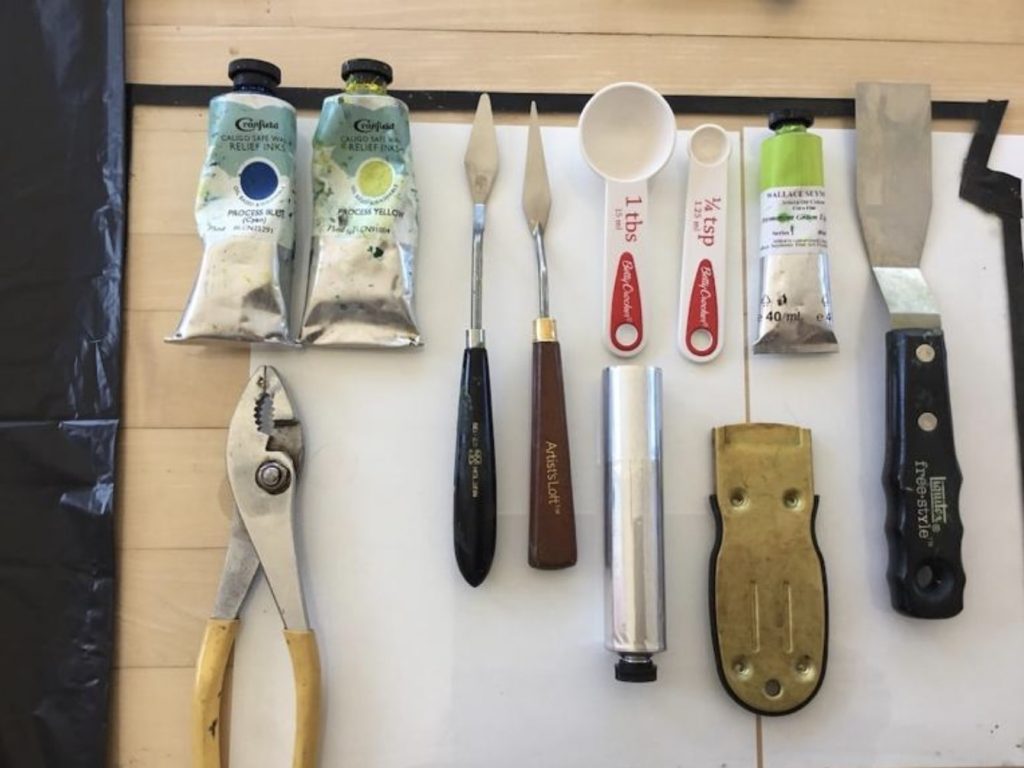
Fig. 1
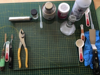
So let’s start … you will need (Fig. 1) :
One tube of process yellow
One tube of process blue
A glass plate
A large palette knife
A small palette knife
One tablespoon (for use with the yellow)
One 1/8 teaspoon (or 1/4 tsp for the blue if you wish to double the recipe)
One 37 ml tube
A pair of pliers
Recipe:
You will use a larger amount of process yellow and a much smaller amount of process blue. You want to achieve a middle to light green, not too light but certainly not too dark. It is much easier to darken a color later on than to try to light it. So decide what shade of green would be suitable. A good idea is to use a tube of permanent green from a reputable brand in oil paint and try to match it.
My recipe was the following: ( I doubled the recipe to fill the 37 ml tube). These proportions are approximate and may vary according to the brand of ink that you are using.
1 tablespoon of process yellow
1/8 teaspoon of process blue
Instructions:
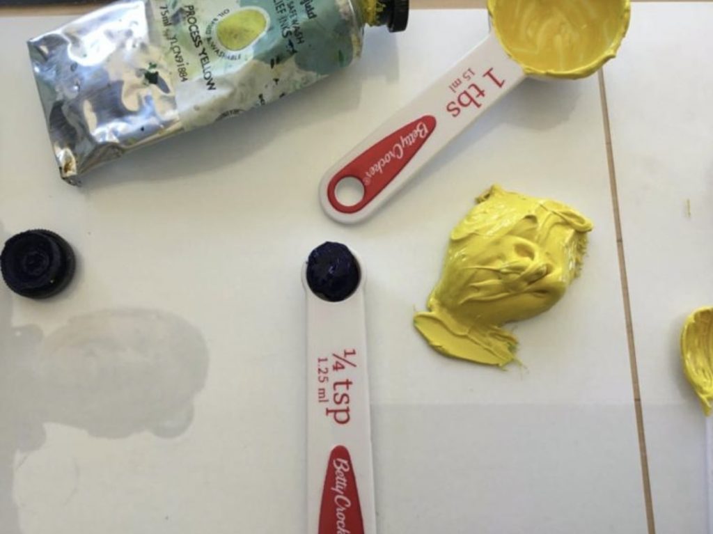
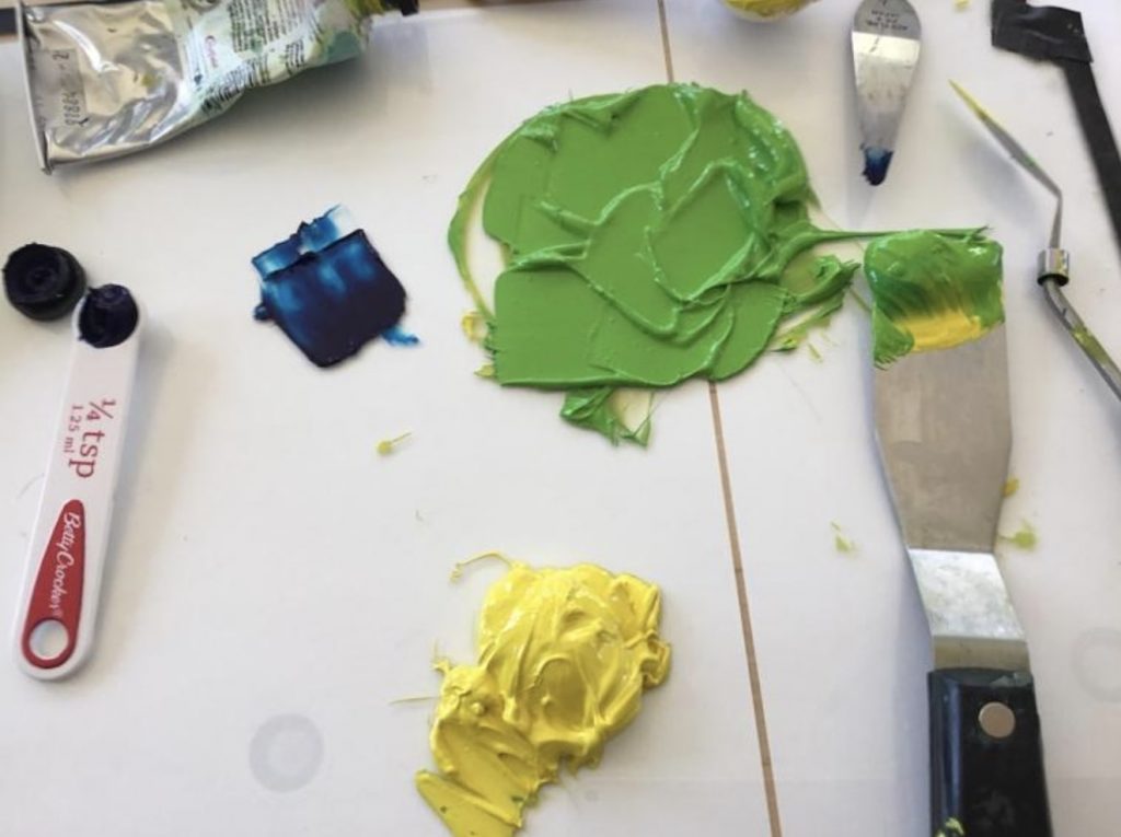
Spread the yellow on a glass plate (Fig. 2). Work the ink until it is soft. Start adding the process blue, slowly until you get the desired hue. Compare that with the permanent green light in oil paint. I used the Seymour Wallace Permanent green light fine oil purchased from Select Fine Arts on St Joseph Blvd in Orléans to get a match. If your green is too dark, as in Fig. 3, just add more yellow.
Fig. 2Fig. 3
You may want to do only one recipe and fill only half the tube, depending on your needs. Start filling your empty tube using the hints from post Transferring Ink. Loosen the cap and tap down to get the ink flowing. Stop around 2/3 full and start pressing down on bottom end. Use pliers to pinch the ends together. Fold the ends twice.
Fig. 4Fig. 5
You will now have a nice tube of permanent green. (Fig. 4) When you want it lighter on your palette, it is then easy to add some yellow; if you want it darker, just add a touch of blue. Fig. 5 shows the home-made green and the Seymour Wallace Permanent green.
Why would you want to make your own ink? Here are a few reasons.
You are looking for a particular colour that is not available in your regular brand of ink.
You use large quantities of certain colours like black or white and it may be practical to make a few large tubes.
In times such as a lock-down in England, certain colours may be out of stock in Canada but pigments are always in stock at Kama Pigments in Montreal.
You are inquisitive about colour and oil absorbency and you like to experiment.
There are a few things to know before you start:
Pigment structure
The crystalline or chemical structure of a pigment will determine its particular shape, size and colour.
Because of their crystalline structure different pigments will absorb different amounts of oil.
As a result of these factors some pigments will require different amounts of oil and will take longer to mill than others.
Pigments are agglomerations of primary particles that can be separated into a dispersion using a muller and an oil binder. Some particles require more oil to completely wet and coat their surface while others require less oil. The quantity of oil necessary is mostly determined by the shape and size of the pigment particle. For example, the cadmium pigment is round and relatively smooth; the alizarin crimson has a more nodular grape-like structure and the ultramarine pigment is more spherical and uneven. Since the milling process calls for the complete coating of every particle, it follows that a particle which is round and smooth would require less oil than one with a nodular or uneven shape. This is what determines the oil-absorption rate. (See below). In the case of pigments, size does matter. The smaller the size of the particle, the larger the overall surface area that needs to be coated with oil in a given volume or weight.
Some may ask if the amount of oil in a given mixture determines the drying time. For example, the burnt umber pigment requires significantly more oil than the titanium pigment in the milling process. (Oil painters have a problem with burnt umber as it creates an issue with the fat over lean principal. This problem is created by the extra oil necessary in the production of this colour.) However, this is not an issue in the case of printing; there is no correlation between the amount of oil that a pigment requires and the drying time. In fact, it is often the opposite. We all know that burnt umber dries quickly while titanium dries slowly.
Oil-absorption-rate
The oil-absorption-rate is measured by the ratio of both pigment (by weight) to oil (by weight). As an aside, there is currently a debate as to whether the measure should be by weight or by volume, but that discussion is for another day. The standard unit of measure for the US is in ounces. For example the quinacridone magenta which we will be mulling would require 100 ounces in linseed oil (by weight) to grind 40-65 ounces of pigment (by weight) to form a stiff paste. The oil-absorption-rate indicates whether the paste contains more or less oil and how its oil content compares with that of other pigment pastes.
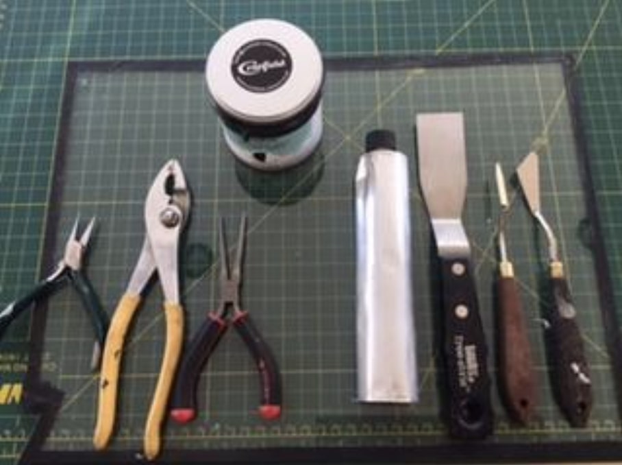
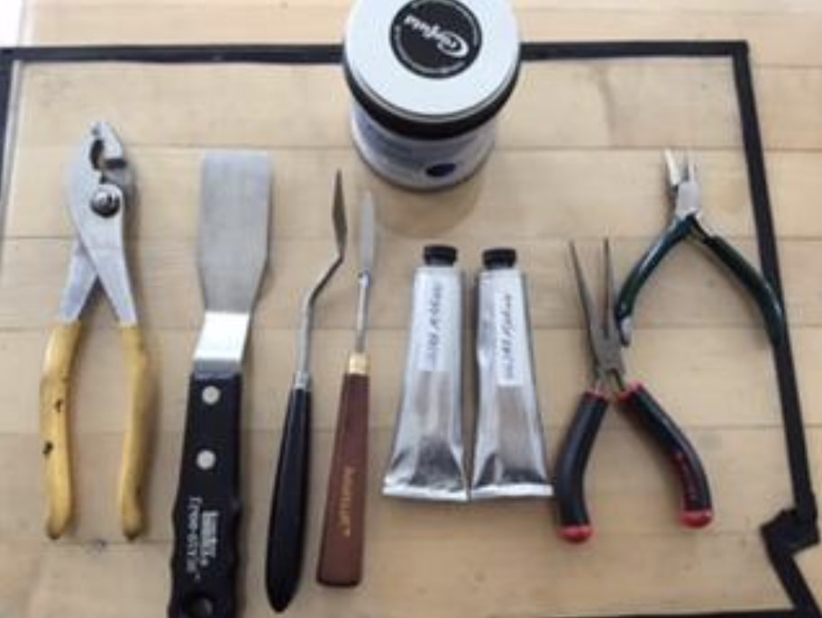
Tools (fig.1)
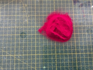
Dry pigment (in this case, Quinacridone Magenta PR122)
A glass muller
Thick plate glass (I use a 6mm thickness)
Linseed oil. I used the Caligo Safe Wash Oil.
Magnesium carbonate (MgCo2)
A wetting agent such as oxgall or isopropyl alcohol
Spatulas, one large, one small
37ml tube
Pliers
Tablespoon
Dropper
Figure 1
Recipe for Magenta PR122.
A good approximation to fill a 37ml tube would be 3 tablespoons of dry pigment.
Linseed oil (see ratio quoted above)
Approximately 1/16 to 1/8 teaspoon MgCo2 per tablespoon of dry pigment.
Note: It’s a good idea to mix one tablespoon of pigment at a time. Also, if the paste is too stiff it is because too much magnesium carbonate was added. You will notice this when comes the time to clean the tools as the paste will tend to stick to the tools. Then all you need to do is add a few drops of oil when comes the time to use the paste. It is easier to add oil to a stiff paste than to add the magnesium carbonate if the paste is too oily.
Preparation of muller and glass plate.
The glass muller comes with a rough flat bottom but needs to be made even rougher. Also, the glass plate needs to be sandedso that it is slightly pitted. The muller comes (if purchased from Kama Pigments) with an 80 grit silicon carbide. Spread this grit on the glass plate and add water. Take the muller and rub it against the grit on the glass plate. (It does make an awful noise). This will roughen both the muller and the glass and will create resistance as the pigment mixture is mulled against the glass. (Fig.2)
Figure 2
Figure 3
Instructions
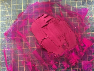
Measure the dry pigment on the glass plate (fig.3). With a dropper, start adding a wetting agent such as oxgall or alcohol to the dry pigment; using a small spatula work the mixture until all the pigments and wetting agent form a paste (fig.4). This step is important in order to break the surface tension of the pigment particles and to allow the particles to better absorb the oil.
Slowly start adding the oil to the paste. I use a dropper for this. At this point, start using a large spatula and start working the mixture carefully blending the oil into the paste. The idea is to obtain a smooth paste. Continue adding oil until the mixture is easily spreadable but not too oily. (Fig. 5).
Figure 4
Figure 5
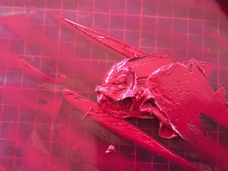
At this point, spread the mixture on the glass plate and start using the muller. Push the muller firmly on the glass plate using a circular movement in the shape of an 8 (fig. 6). Do this for approximately 20 minutes, adding oil if necessary. The bottom part of the muller will gather the mixture along its edges; using the small spatula, remove this paste and reintegrate it to the mixture on the plate. You also need to take the large spatula and frequently gather the mixture which has by now spread over the surface of the glass plate and reposition it in the middle of the plate. Start the process all over again until you feel that the mixture is nice and smooth with no visible dry pigment. The time necessary for a perfectly milled mixture is a function of the shape and size of the particle as explained above.
Figure 6
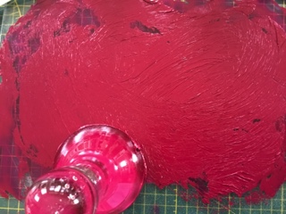
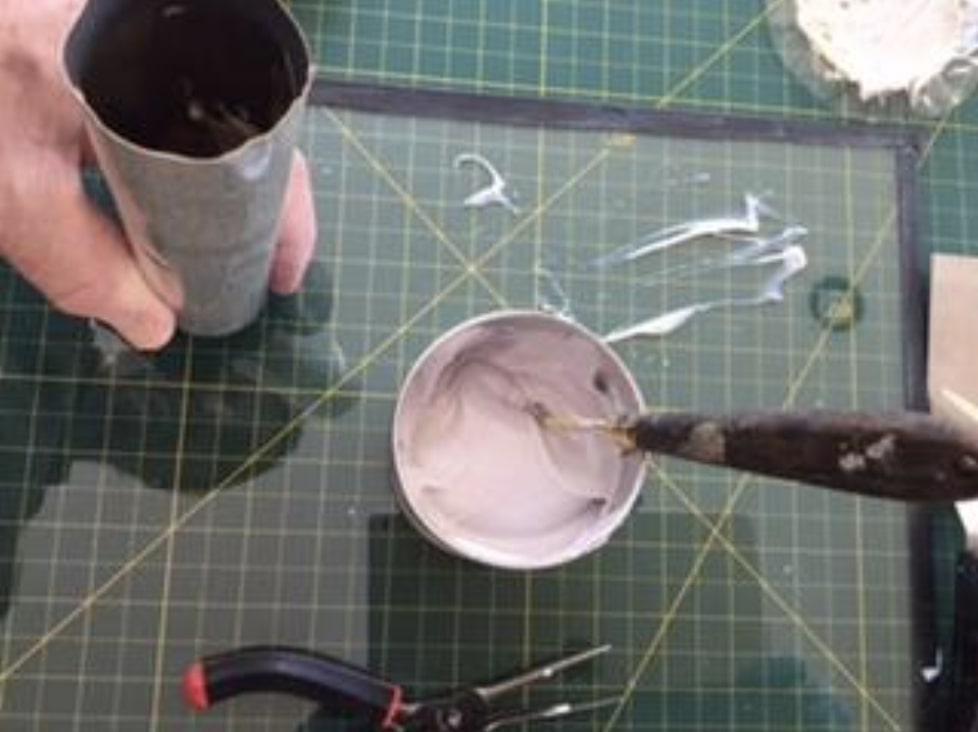
At this point you can set the muller aside after removing all paste underneath and along its edges. Now is the time to start adding the magnesium carbonate. The magnesium carbonate will make the ink sticky so you only need small quantities. Otherwise you will find that it is very difficult to wash off as it sticks to all the tools. You will be using a small spatula to mix the carbonate into the paste. Work it in well. You want a peak but not a stiff peak (fig.7). Your ink is now ready.
Figure 7
Start filling the tube with a small spatula. Hold the tube vertically, with the cap down and slightly unscrewed, As you fill the tube, you need to wrap your fingers around the tube and delicately make a downward movement, hitting a table with the bottom part of your hand so that the ink starts moving down the tube. Try not to tap down on the cap; you don’t want to damage it.
Never fill the tube to the end as you will need to leave some space to pinch the open ends together. Filling approximately 2/3 and a bit more should be about right. Pinch the open ends together using the pliers and fold the ends twice. You may want to put a piece of paper between the metal of the tube and the pliers to avoid damaging the metal.
You now have a perfectly good tube of hand milled inkas used in the print (fig.8). The black border was a mixture of the magenta and phthalo green. The squiggles on the bottom right of the photo were made with the magenta heavily diluted with a plant-based diluent from Wallace Seymour which can be used to retouch a print.
Figure 8
Tools and pigment were purchased from Kama Pigments in Montreal.
The oil measurements were obtained from Ralph Mayer, The Artist’s Handbook of Materials and Techniques.
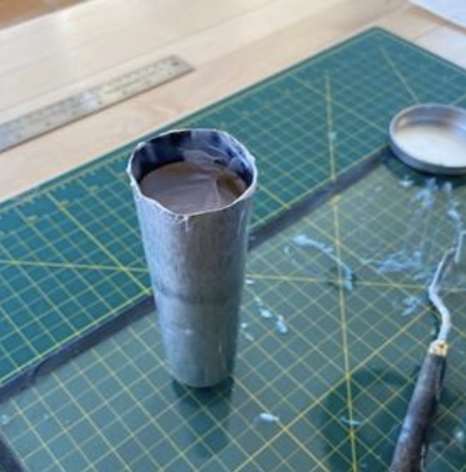
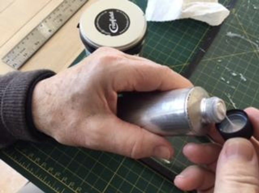
There are a few reasons why one would want to transfer ink from a can to a tube.
The hassle of opening a can and dealing with removing the numerous covers.
The ink has dried and you have to remove the top layer.
You can’t find the right colour in a small tube, like ultramarine.
You want to make your own ink and you need to store it.
The considerable cost savings in buying the larger format.
The ease in transporting tubes as opposed to cans.
Certain colours are out of stock in the smaller tubes, but available in the can.
You use a lot of certain colours, such as white, black, primary colors and of course the extender.
You want to stock up before the next pandemic in case production comes to a halt again.
Cans are messy.
Fig. 1
Here are the tools that you need (Fig. 1). It is really easy and not messy at all.
A glass plate for the mixing
A large spatula
A rubber spatula
A smaller spatula
An empty tube (tube sizes are 37 ml and 125 ml. The tubes are available at Select Fine Arts on St Joseph Blvd in Orleans or directly from Kama Pigments in Montreal)
A pair of pliers
A good blade to clean up
Pull out a good amount of ink from the can onto your glass plate.
Work the ink with a large spatula to soften it if it is too stiff.
Loosen the cap to allow the ink to move down the tube more easily.
Turn the tube upside down; take the small spatula and start filling the tube (Fig. 2)
Fig. 2Fig. 3
After each fill, tap the tube on the glass plate to help move the ink down the tube.
Continue filling the tube, constantly taping the cap lightly on the glass plate.
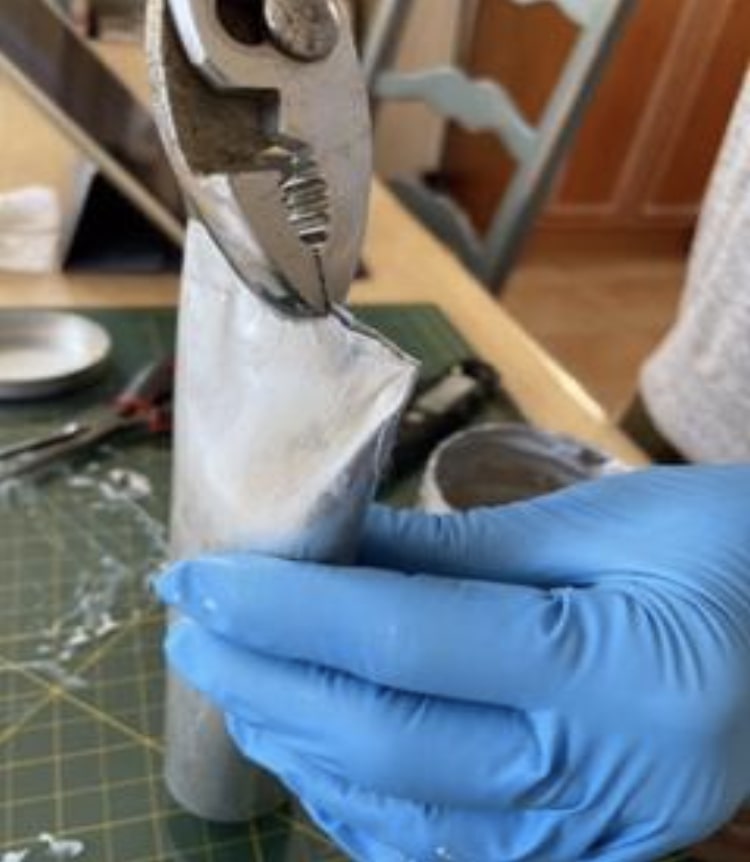
Fill the tube until it is about 2/3 full and start checking that you do not overfill (Fig. 3). You need the space towards the end to be able to shut the tube with your pliers.
Slowly start pressing down on the last 1/3 of the tube making sure that the ink doesn’t overflow.
Take your pliers and squeeze the ends together (Fig. 4)
Fig. 4
Fold the ends twice and squeeze tight.
Take the rubber spatula and clean the inside walls of the can.
Replace the many covers on the ink in the can.
The contents of the can will fill a large 125 ml tube, with enough left over to fill a 37 ml tube (Fig. 5).
Cyanotype is a photographic printing process that produces a cyan-blue contact print through ultraviolet (UV) light exposure. Engineers used the process well into the 20th century as a simple and low-cost process to produce copies of drawings, referred to as blueprints. The process uses two chemicals:
Neither of these chemicals are carcinogens (i.e. they do not cause cancer), nor are they poisons. Rather, they are irritants. They can itch if splashed on your skin in concentration. They will also irritate your eyes. Under normal usage, cyanotype is purportedly one of the safest of all of the chemical photographic processes.
Wallacks, Deserres, and Galaxy Photo all carry cyanotype kits and chemicals but have been having trouble keeping them in stock. You also can buy paper pre-coated for cyanotypes. https://www.artnews.com/art-news/product-recommendations/best-cyanotype-paper-1234570046/ Or you can get the chemicals and apply them to the paper (or fabric) of your choice. You need to use a paper that can take being wetted and soaked.
Printmaking paper (e.g. Legion Revere, Stonehenge, BFK Rives) work. One advantage of applying the chemicals yourself is that you can brush the solution onto the paper in a pattern. You don’t have to cover the whole sheet of paper in an even field if you don’t want to.
Mixing the chemicals and prepping paper. In subdued lighting, mix equal parts Ferric Ammonium Citrate and Potassium ferricyanide to create the cyanotype sensitizer. Mix only the amount you immediately need, as the sensitizer is stable just 2-4 hours. 200ml of working (mixed) solution is enough to coat roughly 50 A4 sheets.
The paper should be coated away from sunlight. Tungsten light, as found in older lightbulbs, is fine. Paper may be double-coated for denser prints. A foam brush will give you a nice even coat. Leave an untreated border around each page so that you can handle the page without touching the chemicals. (Fingerprints or damp fingertips on the treated paper could affect the image.)
Allow to air dry in the dark. Best to dry flat or the solution drips and pools.
The paper can be prepped and stored in a light-blocking bag or box for up to six months. A heavy black plastic garbage bag (e.g. contractor grade) should work.
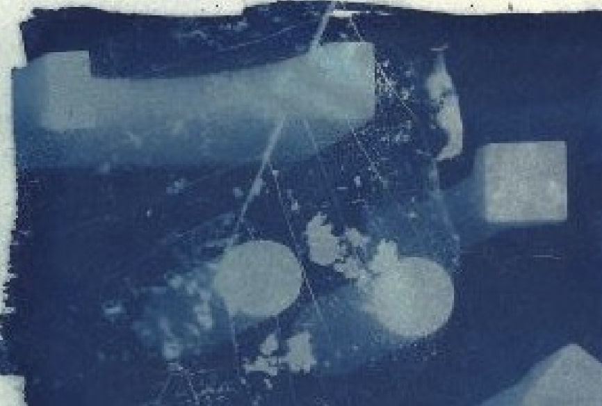
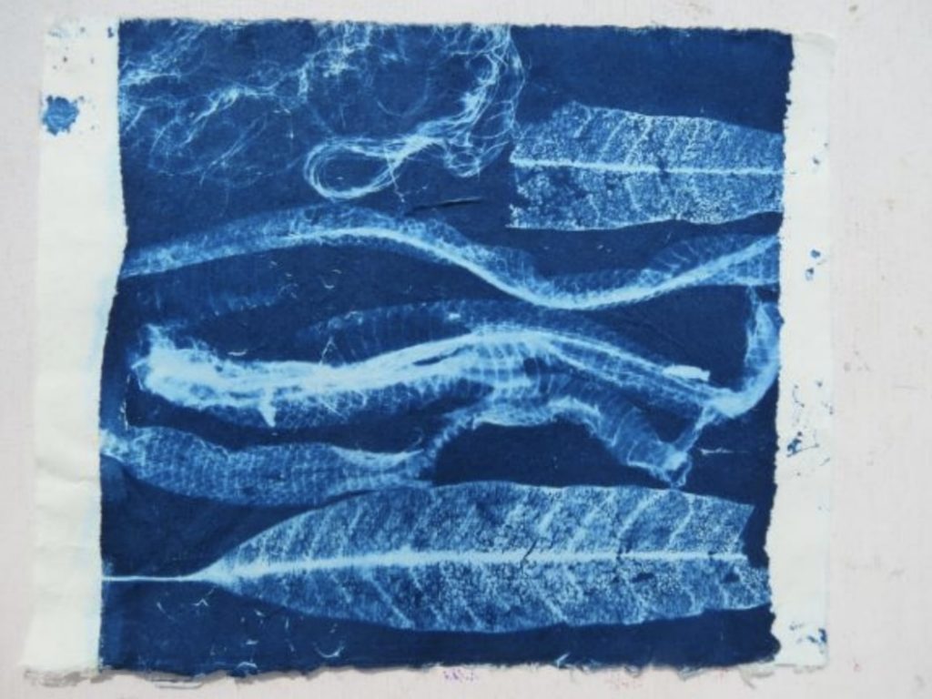
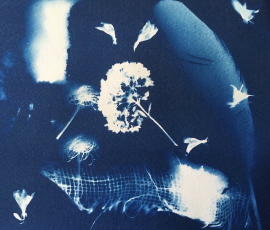
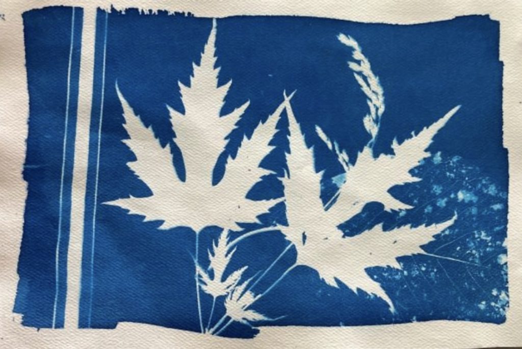
Selecting items for your image. Anything that blocks light – fully or in part – can be used to make a cyanotype. Spots where the light is prevented from reaching the paper will appear as white, once the paper is rinsed.
photos courtesy of Shealagh Pope
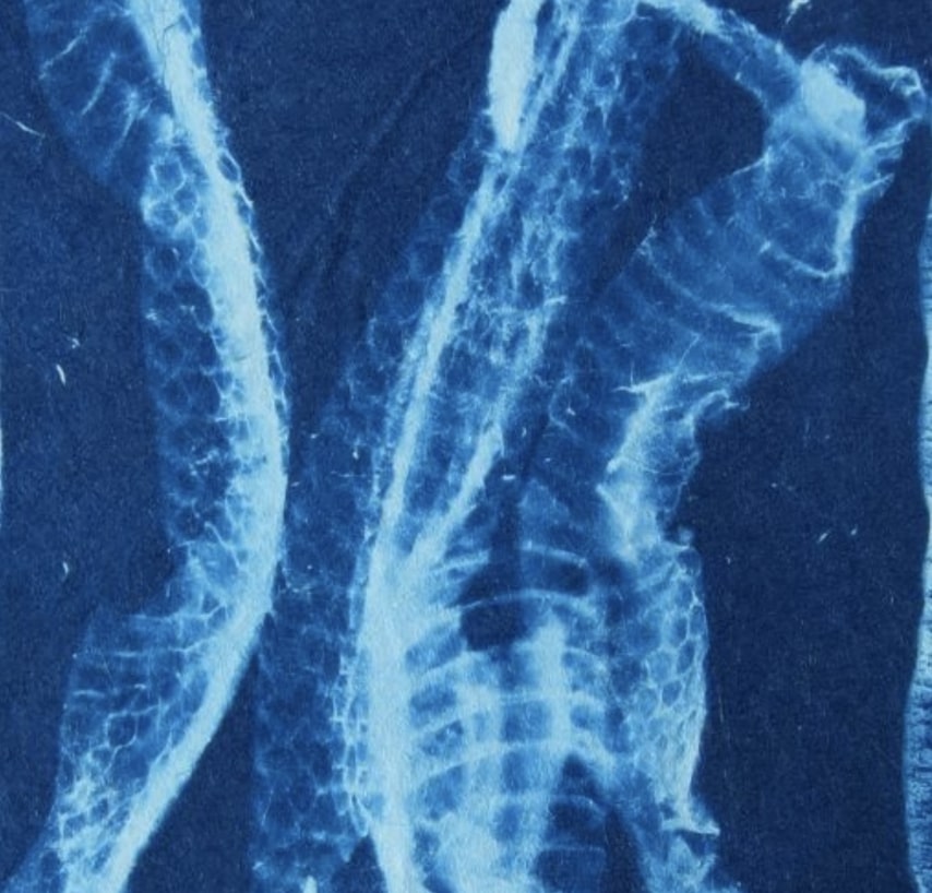
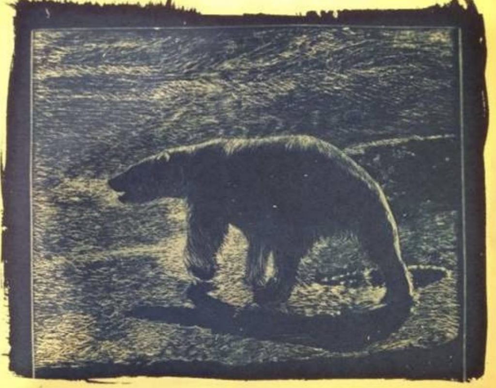
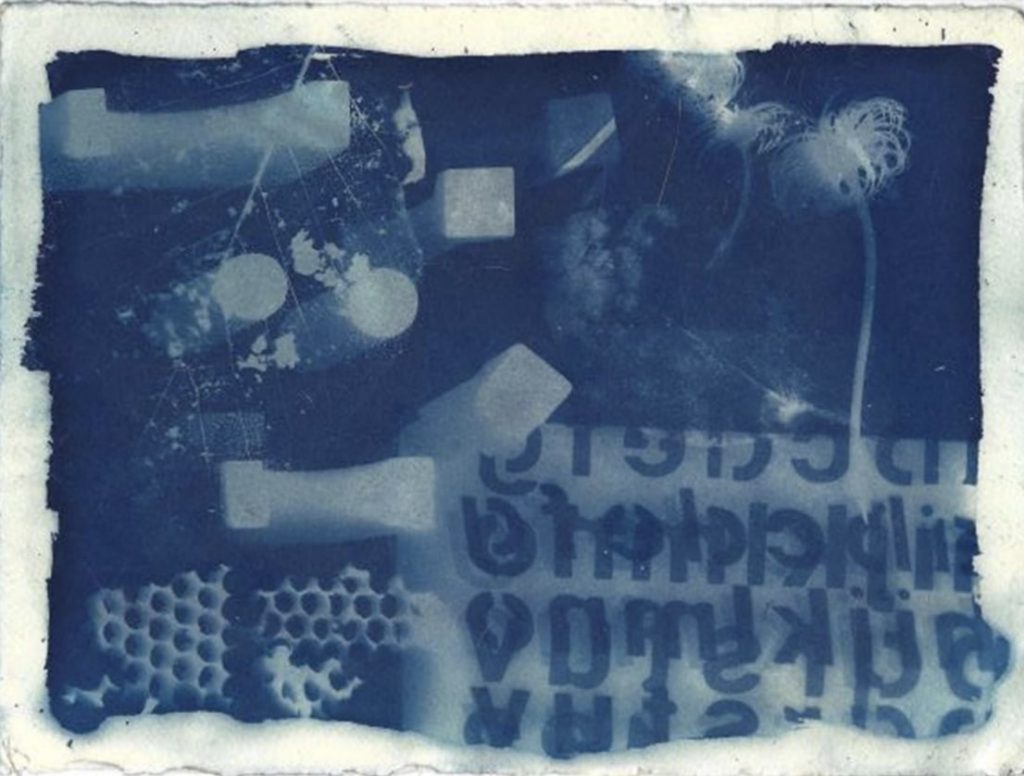
Solid objects – such as a block or a pebble – work like a stencil. Translucent objects will create a graduated impression such as the snakeskin that Val Bridgeman used (left). Taller objects, such as the children’s blocks in Deidre Hierlihy’s print on the right, can cast a graduated “shadow”. Leaves and flowers can produce both solid white and graduated blues depending on their thickness and distance from the paper. A photographic image can be created by printing a negative onto a clear acetate and using the acetate to block the sunlight. Photoshop can be used to make the negative or try http://www.jacquardsolarfast.com/ You also can draw on an acetate, or make a monotype, or use an inked drypoint to produce your cyanotype (see polar bear below printed by Shealagh Pope from a drypoint plate).
Photo courtesy of Shealagh Pope
Exposing the image. Arrange items to print on the treated paper. Place a piece of glass or acrylic on top to keep objects or negatives flush and to keep them from moving during exposure. You may also use pins, magnets, tape, a printing frame, etc. to secure the film during exposure – although any object that is placed directly on the treated paper or that casts a shadow onto it will create a image on the final print.
Check the thrift store for old picture frames from which you can remove the glass. If you use plexiglas, make sure to peel off the protective coating – as this can block the UV needed to make the image.
For the crispest image, the items to form the image should be pressed as tightly as possible against the treated paper. If using an acetate negative, place the ink side against the treated paper. In the case of the drypoint above, plastic wrap was stretched taut over the inked plate so that the inked side could be placed in contact with the treated paper without transferring ink.
Monotype printed at 4 pmMonotype printed at noonPhotos courtesy of Shealagh Pope
Make exposures in sunlight (1-30 minutes, depending on conditions) or under a UV light source. (Note: Over-exposure is almost always preferred to under-exposure.) For a sharp image, the light source should be perpendicular to the paper. If the sun is your lightsource, exposures at the beginning and end of the day may produce fuzzy images. See images above both printed from the same monotype plate. Note that the ink was on the top side of the plate and, therefore, not in contact with the paper.
Do not wet paper before or during exposure. (Unless you are planning to play with wet cyanotype – a whole other day’s worth of experimenting!) Make sure your hands, the treated paper, and the object(s) are dry when handling the sensitized paper. The print may become splotchy if you touch it with damp hands. Sometime leaves or design elements can produce moisture during exposure. You may also have splashed or dripped on the print prior to washing.
The exposed part of the paper will turn a pale bronze colour. This will let you know the print is ready to wash.
Photo courtesy of Shealagh Pope
Fixing the image. Process prints in a tray or bucket of cool water. Make sure when you submerge the print in water, you do so swiftly and without splashing. Wash for at least 5 minutes, changing the water periodically, until the water runs clear. Do not use soap. With wetting, the print will change from a bronze to blue colour.
To instantly process prints to the final deep blue color, submerge washed prints in a dilute solution of hydrogen peroxide, then rinse.
Air-dry the prints on a clean clothesline or on newsprint or blotting paper. Dry away from direct sun. If peroxide was not used, prints will slowly oxidize to their final, deep blue color over the course of about 24 hours. If the print darkens during drying, it was probably not thoroughly washed.
If you do not have water to hand, place your exposed paper back in a lightfast bag or box to wash later. (Useful if you take your paper into the field for plein-air cyanotype!)
• Mold growth may occur in the Ferric Ammonium Citrate (dark green) solution over time. This will not affect the performance of the chemistry. Skim off any mold or decant the solution through a coffee filter before use.
• Sensitized paper or fabric may be stockpiled and stored. Use within 6 months for best results. Store in a cool, dry environment, preferably in a sealed bag to avoid oxidation.
• Coated paper and fabric may darken over time. If it appears dark, it is not necessarily expired; test it—it may just require a longer rinse in hotter water.
• Cyanotype prints are archival. However, yellowing may occur if prints are exposed to phosphates or high pH solutions. Cyanotype printed fabrics should always be laundered in cold water using non-phosphate detergents. Use care while handling cyano-type prints, as sweat and hand oils may also cause discoloration.
PUTTING IT ALL INTO PRACTICE
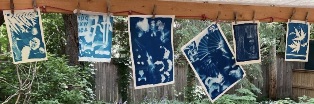
Deidre Hierlihy, Val Bridgeman, Luigina B, Shealagh Pope, and Katherine Stauble got together IN REAL LIFE to try out cyanotypes. Below is some of the output from a very fun and productive morning.
Group activity Photo courtesy of Shealagh PopeVal Bridgeman -Leaves and Snake SkinDeidre Hierlihy -blocks, stencil, honeycomb, leaf skeleton, clematisKatherine Stauble -flowers, burlap, featherLuigina Baratto – leaves, grass, leaf skeleton, ribbon
This part 1 of 2 parts. Volet 1 de 2 : les étapes.
Lorsque je vais aux expositions de l’OGPC je constate que bien peu d’entre nous ne s’adonnent à l’art de la sérigraphie. Est-ce parce
que l’on
pense que la sérigraphie ne sert qu’à imprimer des T-shirts ? Ou est-ce tout
simplement parce que l’on ne s’est pas arrêté à connaître cette technique ?
L’article
qui suit vous donnera une définition des étapes qui mènent à la création d’une sérigraphie. Cet article sera
suivi, le mois prochain, par un survol de chacune de ces étapes ainsi qu’une liste des outils vous permettant
de vous équiper et de monter votre studio.
QU’EST-CE
QUE LA SÉRIGRAPHIE? C’est « une technique d’impression par laquelle on applique une mince couche d’encre, selon un motif défini, sur
une feuille de papier ou tout autre support placé en dessous d’un écran. La raclette presse alors l’encre qui traverse les ouvertures de
la trame du tissu tendu de l’écran. Le motif est délimité par le clichage qui
consiste à boucher la trame du tissu là ou l’encre ne doit pas traverser. »
LE CLICHAGE : Plusieurs techniques peuvent ici être utilisées afin d’obstruer les parties de l’écran qui
ne doivent pas être imprimées : papier-pochoir, film de découpe, liquide de
remplissage etc. Personnellement je favorise le procédé photographique. « Le
bouche-pores utilisé est une émulsion sensible à la lumière qui a la propriété
de durcir lorsqu’elle est exposée à la lumière, devenant ainsi insoluble à l’eau. On délimite le motif à imprimer
par exposition de la couche d’émulsion qui est mise en contact avec une feuille
d’acétate
transparente sur laquelle le dessin a été opacifié. Ces zones opaques empêchent
les rayons ultra-violets d’atteindre l’émulsion qui se dissoudra à l’eau alors quel les zones exposées se
durciront et deviendront l’élément qui bouchera le tissu pour empêcher le
passage de l’encre.
»
LES ENCRES : « les encres et peintures sérigraphiques sont préparées à
partir de pigments dont la granulation varie entre 5 et 10 microns. Les tissus
les plus fins … représentent une ouverture de mailles de 25 microns : ce qui
revient à dire que les encres passent facilement à travers les mailles…on ne
peut employer n’importe quelle sorte de peinture en sérigraphie. »
L’opacité
ou la transparence des couleurs ainsi que la juxtaposition et la superposition
des plans de couleurs sont déterminées par les effets de profondeurs de
légèreté etc. désirés.
L’IMPRESSION
: L’écran est fixé par des charnières sur la base d’impression (une table). Le support
est placé sous l’écran. L’encre est déposée sur le haut de l’écran. À l’aide d’une raclette l’encre est distribuée sur la surface
de l’écran.
REPÉRAGE : Il est essentiel de
développer un système de guidage qui permettra de déposer le support (papier)
au même endroit pour qu’il y ait « une parfaite similitude des impressions du tirage. Pour cela
on pose des guides ou taquets contre lesquels le papier vient buter quand on le
place pour l’impression.
»
RÉCUPÉRATION DE L’ÉCRAN : Il faut nettoyer rapidement l’écran afin que l’encre ne sèche pas et n’obstrue pas les mailles de l’écran.
On enlève d’abord
le surplus d’encre
qui se trouve sur l’écran au moyen d’une spatule. Ensuite à l’aide d’un
solvant on dissout les films et autres produits utilisés pour boucher les
pores. L’écran est finalement nettoyé à l’eau et mis à sécher pour une
utilisation ultérieure.
Traduction:
Raclette: squeegee
Clichage: blocking
out
Ecran: screen frame
Trame: screen mesh
Encres: ink
Pochoir: stencil
Impression:
pressing the ink against the mesh into the paper
This is the second part of a two-part article on silkscreen printmaking by Louise Lépine.
Vous trouverez ici un survol de l’équipement nécessaire à la
réalisation de sérigraphies. La
description de l’usage de cet équipement, bien que non exhaustive, vous donnera
un aperçu de leur
utilisation. J’ajoute des commentaires
sur mon expérience et mes préférences pour certains matériaux ainsi que la mention de quelques
commerces où je
m’approvisionne. En fin de texte vous
trouverez en Annexe 1 un tableau qui contient les photos qui illustrent
plusieurs des éléments dont je discute dans le texte. L’Annexe 2 est né plus
tard quand on m’a demandé des précisions sur ma table de sérigraphie construite
pour mes besoins.
Vous remarquerez que je favorise les commerces canadiens et
que j’évite les multinationales. Il va sans dire que l’artisan[1] néophyte est encouragé à suivre un cours qui
le guidera dans son apprentissage.
D’excellents cours sont donnés à l’École d’art d’Ottawa.
Le cadre (aussi appelé l’écran) sur lequel la trame est tendue peut être de bois ou de métal.
Bien que le cadre
de bois puisse être fabriqué à peu de coût par un artisan et qu’on le
retrouve facilement dans le commerce, on a constaté à l’usage que ces cadres se
déforment et que de ce fait la trame se détend.
Mieux vaut donc s’équiper de cadre en métal : ils sont légers et durables
et la trame demeure bien tendue.
La dimension d’un cadre est déterminée à partir de
l’intérieur du cadre. On doit prendre en
considération la dimension de l’image
à imprimer et ajouter un espace additionnel au périmètre, qui permettra de déposer la raclette
et le surplus d’encre. Il faut aussi prendre en considération la grandeur de
l’évier dont on dispose pour le dépouillement de l’écran.
J’achète mes cadres et les fais réparer au besoin dans ce commerce torontois https://www.gsdye.com/screen-equipment.html. À
noter que les cadres pour imprimer sur le tissu ont une trame moins fine que
ceux qu’on utilise pour
imprimer sur du papier. On utilise
généralement des cadres No 110 pour le tissu et No 230 pour le papier.
Le clichage – Bien que l’on puisse utiliser un pochoir, des liquides de remplissage comme les bouche-pores etc… la technique que j’ai apprise à l’Université, l’émulsion photosensible, demeure ma préférée. J’ai longtemps utilisé les produits de marque « Speedball » constitués de photo émulsion et d’un sensibilisateur communément appelé Diazo. Ces deux composantes, lorsque mélangées, doivent être utilisées dans les trois mois. Présentement j’utilise un produit mélangé à l’usine et que je peux conserver un an. Le site : http://metrographicsupplies.com/ vous informera sur les variantes de ce produit et le personnel du service à la clientèle pourra vous guider judicieusement.
L’émulsion photographique est appliquée sur l’écran avec
l’instrument qui tient de la raclette et d’un récipient, le « scoop
coater ». Puis on laisse sécher
l’écran à la noirceur. J’ai acheté mon
« scoop coater » en même temps que mes écrans et ma
raclette : https://www.gsdye.com/screen-equipment.html
L’image à imprimer– L’image peut être un dessin ou même une photo[2]. Elle doit être transférée sur un acétate. Pour éviter des frais, on peut imprimer l’image à partir d’une photocopieuse. Il suffit de mettre quelques gouttes d’huile sur le papier imprimé et voilà!
Peu importe, acétate ou papier, il est essentiel que cette
image soit d’un noir profond.
L’exposition à la luminière – L’artisan peut obtenir de très bons résultats à partir d’un équipement rudimentaire : une source lumineuse, une vitre sur laquelle on dépose l’image, l’écran photosensible, une planche qui recouvre l’écran et un poids pour assurer un bon contact. Le temps d’exposition à la lumière dépend de la lampe utilisée. J’expose mon image sur une table conçue par mon mari (voir photos en Annexes 1 et 2). Libre à vous d’en construire une semblable.
Dans son livre, L’art de la sérigraphie,
Louis Desaulniers[3]
illustre bien les composantes d’un tel appareil (CF annexe).
Les encres – Il est facile de composer ses propres couleurs : le rouge, jaune, bleu, noir et blanc suffisent amplement. Ici encore les produits « Speedball » se retrouvent sur toutes les étagères. En plus des couleurs, il est utile de s’équiper de produits qui donnent de la transparence à nos encres[4], ou encore d’en augmenter le volume lorsque nous constatons qu’il nous reste peu d’encre pour terminer une impression.
Mais, si on veut des couleurs hors de l’ordinaire, je vous
recommande d’utiliser celles de « Wallace Seymour». En y ajoutant du « Screenprinting
Paste », ces encres s’adaptent parfaitement à la sérigraphie. Vous les retrouverez exclusivement chez le
commerce Select Fine Arts
Materials à Orléans. https://selectfineartmaterials.com/
L’impression – Il est primordial que le cadre soit stable. Pour ce faire il suffit de le fixer à une table au moyen de charnières à sérigraphie. https://www.gsdye.com/screen-equipment.html
Le support/le papier doit être lisse et absorbant. Le papier BFK Rives est largement utilisé
pour la sérigraphie. Il est important de
le prendre suffisamment épais (250g/m²) afin de faciliter la manipulation.
Récemment j’ai utilisé un papier fait au Canada à la Papeterie
St-Armand de Montréal. Là encore on le
retrouve chez Select Fine Arts
Materials.
Le repérage – Assurez-vous, à l’aide d’onglets, que le papier reste dans la même position à chaque succession d’impressions des pochoirs et/ou d’images transférées sur acétate.
Le dépouillement de l’écran – Il est primordial de ne pas laisser sécher l’encre sur l’écran. Donc, dès que vous avez terminé d’encrer votre dernière épreuve, passez l’écran sous l’eau jusqu’à ce que les mailles correspondants à l’image à imprimer soient ajourées. Sécher ensuite l’écran. Vous pourrez alors imprimer l’image à nouveau.
La récupération de l’écran – Immédiatement après avoir encré, il faut enlever le surplus d’encre puis enlever l’émulsion photographique à l’aide d’un produit spécialement conçu à cet effet. Passer ensuite l’écran sous l’eau. http://www.thescreenprintstore.ca/categories/Screen-Reclaimers/
Il est recommandé d’utiliser un jet d’eau puissant afin
d’éliminer tout trace d’encre et d’émulsion.
Il est facile de respecter cette directive lorsque l’on a un atelier
muni d’un grand évier ou encore lorsque l’on peut effectuer cette opération à
l’extérieur. En été, j’utilise mon
nettoyeur à haute pression mais, en hiver, avec de bons produits et un pommeau
à douche qui offre une bonne pression, dans un évier assez grand pour recevoir
le cadre employé, j’arrive aisément à récupérer mes écrans.
[1]Dans le présent document, les termes employés pour désigner des personnes sont pris au sens générique; ils ont à la fois valeur d’un féminin et d’un masculin.[2] L’œuvre « Bons baisers d’Australie », en Annexe 1, a été réalisée à partir d’une photo. De plus, on remarquera ici la technique du chine-collé. [3] Louis Desaulniers, L’art de la sérigraphie, 1976, Les Presses de l’Université du Québec, p.133. ISBN 0-7770-0170-5 [4] J’ai abondamment utilisé la transparence dans mes premières sérigraphies comme en témoigne « Au-dessus de l’étang » mis en Annexe 1.
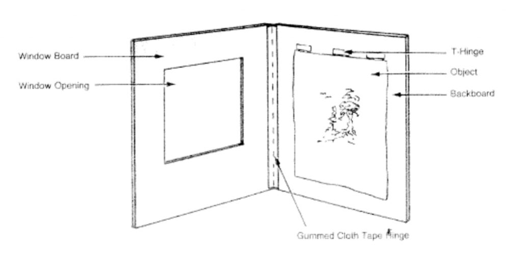
We were very fortunate and delighted to have Heather McLeod give a presentation on archival matting at our AGM in December. Heather is a professional framer at the National Gallery of Canada; she is also a member of OGPC.
Heather covered a number of aspects on the subject, including a demonstration of how to prepare a mat package with archival products, i.e. how to hinge the mat window to the matboard as well as how to properly secure the artwork to the matboard. She demonstrated the T-hinge, the V-hinge and the pocket method and discussed the importance of using archival quality tape and gummed paper. The products are the following: gummed paper hinging tape and Hayaku or Mulberry hinging paper, both by Lineco as well as Neschen Filmoplast P90.
The hinging tape is thicker and is used to tape the window mat to the backing, usually matboard, in the form of a V. The hinging paper or hinging tissue is thinner and is used to tape the artwork to the matboard. Both are pH neutral and therefore safe for archival and long-term conservation. Another option is to make a pocket or corner piece using archival paper or Japanese paper made from 100% koso fibers and taping it to the matboard. Japanese paper is often used by conservators to make paper hinges. (See articles below for instructions.)
Figure taken from Ref 1. Library of Congress
A question was asked on how to prepare a frame when a mat is not required such as for a more contemporary look (also called bleed mounting). Here are 3 possibilities:
A thin piece of acid-free foam core to fit the rabbet of the frame. This involves cutting and applying glue to either the frame or the foam core, unless the foam core is self-adhesive.
An acrylic spacer or separator. Spacers are available in black, white or clear. These have the advantage of being inert, therefore archival. They frequently come with an adhesive. The disadvantage is in the cutting. A saw is needed and perhaps a good clamp. However, the look is clean and would not flatten over time. The cost is also a factor. They range from $5-6 at Deserres to $18 at a frame shop. They usually come in 5 ft lengths. Canus Plastics sells a clear spacer in 6 ft lengths for $3.
Ragboard strips laminated together with archival paste can be attached to the glazing.
To prevent wood lignin and acids from the side of the wood frame migrating to the artwork, it was suggested lining the inside of the frame with metallic tape (the type used to seal a furnace).
This leads us to consider the different types of matboards and the nature of the papers that make up the matboards, i.e. the surface papers, (face and backing) and the core of the matboard.
The following discussion is put together from various online sources and any error of interpretation is entirely mine. However, the URLs referenced below are sourced from recognized expert advice and make for fascinating reading.
What is the difference between Museum, Conservation, White Core and regular mat board?
Essentially, Museum quality matboard has the most exacting standards and would be used for rare and valuable art works. It is made entirely from cotton fibers.
All others, including Conservation, White Core and other regular matboards are made from wood pulp. The wood pulp contains cellulose, lignin & other acids. The lignin and acids would contaminate the paper if they were not removed.
The permanence of the paper/matboard comes from the strength of the fiber and the purity of the cellulose that composes it.
Cotton pulp is mostly cellulose with minute quantities of lignin and is the purest for long-term preservation. For Museum quality, all surfaces of the matboard i.e. the face, back and core papers involved in the lamination process have to be from cotton cellulose.
For matboards made from wood pulp, it is the percentage of cellulosic material present in all surfaces of the lamination that determines whether a matboard can be considered for longer-term conservation. Conservation matboard would have close to 98% cellulose and the lignin content would be no more than 0.65% after processing. This is called “high alpha-cellulose” (some paper makers such as St. Cuthbert’s Mill consider 94% cellulose as conservation quality.) The lignin and other acids such as Sulphur, Iron and Copper present in the wood pulp would have been extracted by mechanical means. The process of de-acidification is done by adding calcium or magnesium bicarbonates to neutralize the acids and bring the pH level of the pulp to 7 or higher. An additional bicarbonate reserve is added to act as a buffer on the paper so that acids which could migrate over the years would be neutralized by the bicarbonates. Over time, (a few decades and up to 100 years) it is possible that the reserve of carbonates would no longer be able to neutralize the acids, and the paper could suffer yellowing and possibly some deterioration. These are considered archival.
pH neutrality is truly applicable to aqueous solutions where it is possible to control the balance between hydrogen ions. In other mediums such as paper, especially wood-pulp based paper, other ions are present such that adjusting the pH level is a matter of introducing counterbalancing agents such as bicarbonates to make the solution more alkaline. The term acid free is often used incorrectly as a synonym for lignin-free.
All Museum quality is archival but not all archival is museum quality. For example, Conservation matboard is considered archival because of its high alpha-cellulose content. But it would not be Museum quality.
The term “archival” is nontechnical and can be misleading, broadly suggesting that a material is permanent or chemically stable. The term is not quantifiable as no standards exist that describe the exact qualities of an “archival” material. This definition is from the PPFA, the Professional Picture Framers Association.
Today, most regular matboards have some basic treatment to neutralize against the excessive acidity that is released when lignin, the binding polymer in wood, breaks down. But regular matboards should not be used to frame serious artworks.
Environmental conditions, such as humidity, light exposure, lightfastness of colored matboard, sizing, pollutants, as well as inappropriate framing techniques could cause deterioration of the artwork over time. Of course, the chemicals present in the ink as well as poor quality printing paper could also affect the artwork.
The major matboard company in Canada is Peterboro Matboards. They have 3 classifications for their matboards.
Museum grade: 100% cotton fibers.
Conservation quality: high alpha-cellulose (98%); made from wood pulp.
White Core quality: slightly lower alpha-cellulose, made from wood pulp. The surface and backing are acid free, while the core would not be acid-free and would contain optical brighteners to prevent discoloration. White Core grade matboard is not suitable for preservation matting.
Peterboro also makes a 2-ply 100% cotton board, which can be used for various mounting purposes such as an interleaf. It is available at DeSerres in a 16”X20” sheet.
As a complement to Heather McLeod’s presentation at the AGM, here are 5 references for those who were unable to attend the AGM. You will find demonstrations of the various methods of hinging as well as technical information on paper classification. The articles by Hugh Phibbs are particularly interesting. Mr. Phibbs was Coordinator of the Preservation Services, Conservation Division of the National Gallery of Art, Washington, DC.
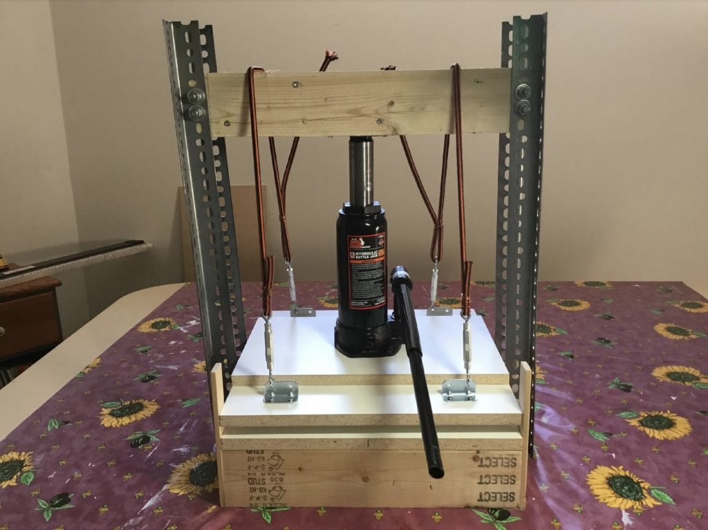
Since I was new to printmaking and didn’t know whether I would continue to seriously pursue my skills, I thought it best to make a press rather than investing in an expensive one. As it turns out, it was a good investment of less than two hundred dollars. It works well, is solid and easily transportable.
I went for a 15” wide platen which seemed an ideal width to allow slightly larger prints. If I use a wide paper, I find it’s a good idea to roll the side edges from the back of the paper to ensure good coverage of the sides. The length is irrelevant as I can move the register front and back and simply come down with the bottle jack a few times. Below is a photo of the finished product. Here is the link to a web site article (no press no problem) which gives all the dimensions and materials needed. All the materials which were used are available in Ottawa. The metal posts are available at Canadian Tire, Home Depot and Lowes.