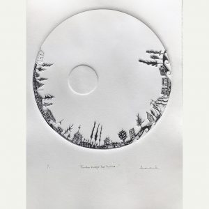
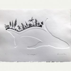
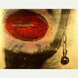
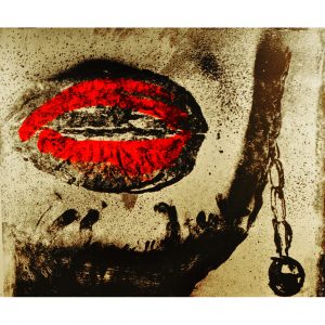
Driven by biology and powerful narratives, humans have transformed and dominated Earth like no other species. This exhibition titled “It’s the Economy” examines, in the context of the Anthropocene, the paradigm of economic growth, mass production, and mass consumption.
Shirley Yik is an Ottawa artist whose practice includes printmaking, drawing and painting. Her work explores human-created systems in relations to the Anthropocene and our societal values. She holds a Diploma of Fine Arts from the Ottawa School of Art, Master degrees in Management Studies and Information Systems Science at Carleton University.
The artist gratefully acknowledges the support of the City of Ottawa and the Ontario Arts Council.
Encouragés par leur biologie et de puissants narratifs, les humains ont transformé et dominé la Terre comme aucune autre espèce. Cette exposition intitulée «C’est l’Économie» examine, dans le contexte de l’Anthropocène, le paradigme de la croissance économique, de la production de masse et de la consommation de masse.
Shirley Yik vit à Ottawa et sa pratique artistique inclut la gravure, le dessin et la peinture. Son travail explore les systèmes créés par l’homme en rapport avec l’Anthropocène et nos valeurs sociétales. Elle est titulaire d’un diplôme en Beaux-Arts de l’École d’art d’Ottawa, de Maîtrises en études de gestion et science des systèmes d’information de l’Université de Carleton.
L’artiste tient à remercier vivement pour leur support la Ville d’Ottawa, le Conseil des Arts de l’Ontario et le Centre des arts Shenkman.
L’entrée est gratuite. Un masque, une distance physique et une preuve de vaccination sont requis. https://shenkmanarts.ca/updates
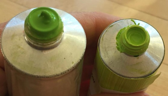
Why would you want to pre-mix a green hue and store it in a tube? Is it not easier to just mix yellow and blue on your palette and hope for the best? However, if you want a consistent green that is pre-mixed according to a fixed formula, having a tube ready to go is very handy when you are in a hurry and you need to focus on mixing other colours.
I often wondered, why, in oil painting, every brand has a Permanent Green Light until I bought a tube and realized how handy it is to have a consistent green that I can easily lighten or darken according to need. A little more blue will turn it into permanent green medium while more yellow will give you various shades of apple green.
Apparently, there is no reason to call the colour “Permanent green”; it just started that way and no one knows why. It has nothing to do with the permanence or lightfastness of the pigments. In fact, in the case of printing inks, the yellow that is used is mostly PY3, or Hansa yellow which is listed as moderately lightfast.
For the purpose of this mixture, we will use Process yellow and Process blue from Calego Safe Wash ink. This Process yellow is listed as PY3, or Hansa yellow, a Monoazo, also called Arylide yellow. The masstone is a bright lemon yellow with a slightly greenish undertone. It is semi-transparent. It is best to avoid the Diarylide yellow as the undertone has a reddish tint. Hansa yellow is a synthetic organic pigment. Organic yellow pigments tend to be less lightfast than non-organic pigments such as the cadmium yellows. The Process blue used in the mixture is phthalocyanine blue or PB15:3, which has a deep blue in mass tone with a greenish blue in shades. The phthalocyanine family of pigments has good lightfastness, but dulls over considerable time.
So here’s an easy way to make a tube of your own permanent green. In the post Transfering ink we saw how easy it is to fill an empty tube with ink.
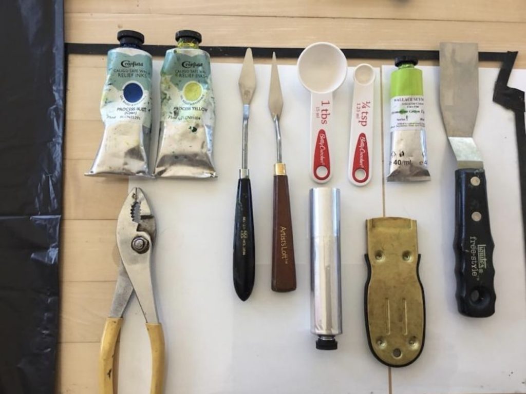
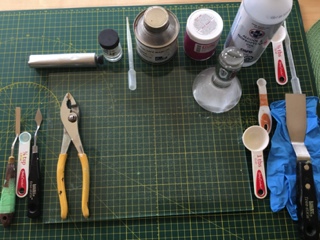
Fig. 1
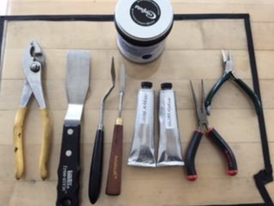
So let’s start … you will need (Fig. 1) :
One tube of process yellow
One tube of process blue
A glass plate
A large palette knife
A small palette knife
One tablespoon (for use with the yellow)
One 1/8 teaspoon (or 1/4 tsp for the blue if you wish to double the recipe)
One 37 ml tube
A pair of pliers
Recipe:
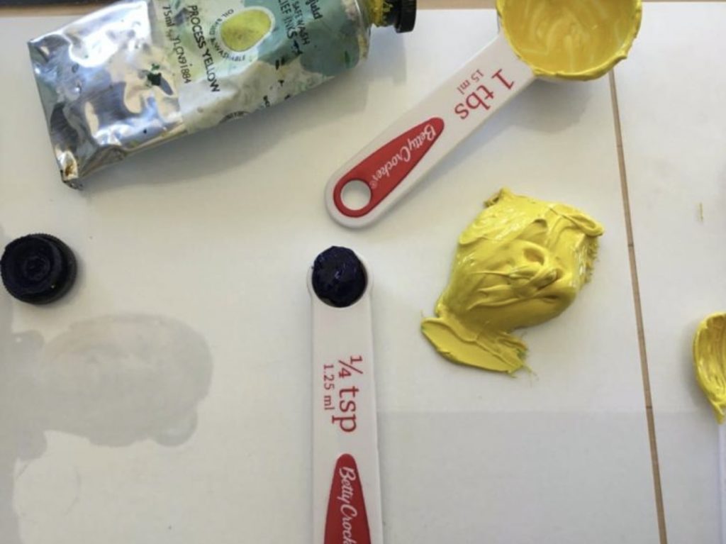
You will use a larger amount of process yellow and a much smaller amount of process blue. You want to achieve a middle to light green, not too light but certainly not too dark. It is much easier to darken a color later on than to try to light it. So decide what shade of green would be suitable. A good idea is to use a tube of permanent green from a reputable brand in oil paint and try to match it.
My recipe was the following: ( I doubled the recipe to fill the 37 ml tube). These proportions are approximate and may vary according to the brand of ink that you are using.
1 tablespoon of process yellow
1/8 teaspoon of process blue
Instructions:
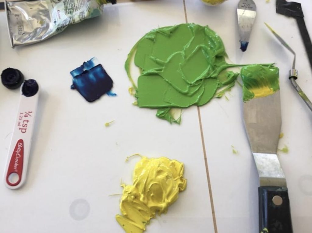
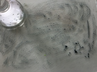
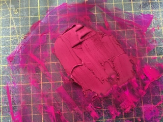
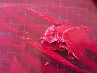
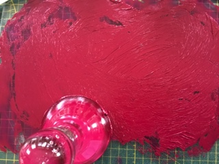
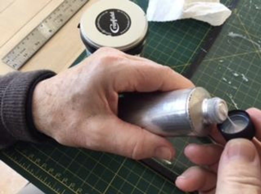
Spread the yellow on a glass plate (Fig. 2). Work the ink until it is soft. Start adding the process blue, slowly until you get the desired hue. Compare that with the permanent green light in oil paint. I used the Seymour Wallace Permanent green light fine oil purchased from Select Fine Arts on St Joseph Blvd in Orléans to get a match. If your green is too dark, as in Fig. 3, just add more yellow.
Fig. 2Fig. 3
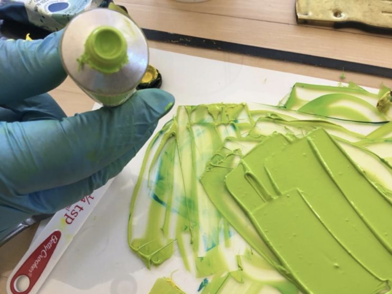
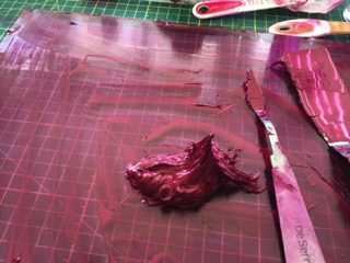
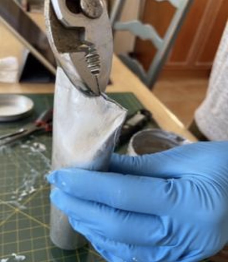
You may want to do only one recipe and fill only half the tube, depending on your needs. Start filling your empty tube using the hints from post Transferring Ink. Loosen the cap and tap down to get the ink flowing. Stop around 2/3 full and start pressing down on bottom end. Use pliers to pinch the ends together. Fold the ends twice.
Fig. 4Fig. 5
You will now have a nice tube of permanent green. (Fig. 4) When you want it lighter on your palette, it is then easy to add some yellow; if you want it darker, just add a touch of blue. Fig. 5 shows the home-made green and the Seymour Wallace Permanent green.
Why would you want to make your own ink? Here are a few reasons.
You are looking for a particular colour that is not available in your regular brand of ink.
You use large quantities of certain colours like black or white and it may be practical to make a few large tubes.
In times such as a lock-down in England, certain colours may be out of stock in Canada but pigments are always in stock at Kama Pigments in Montreal.
You are inquisitive about colour and oil absorbency and you like to experiment.
There are a few things to know before you start:
Pigment structure
The crystalline or chemical structure of a pigment will determine its particular shape, size and colour.
Because of their crystalline structure different pigments will absorb different amounts of oil.
As a result of these factors some pigments will require different amounts of oil and will take longer to mill than others.
Pigments are agglomerations of primary particles that can be separated into a dispersion using a muller and an oil binder. Some particles require more oil to completely wet and coat their surface while others require less oil. The quantity of oil necessary is mostly determined by the shape and size of the pigment particle. For example, the cadmium pigment is round and relatively smooth; the alizarin crimson has a more nodular grape-like structure and the ultramarine pigment is more spherical and uneven. Since the milling process calls for the complete coating of every particle, it follows that a particle which is round and smooth would require less oil than one with a nodular or uneven shape. This is what determines the oil-absorption rate. (See below). In the case of pigments, size does matter. The smaller the size of the particle, the larger the overall surface area that needs to be coated with oil in a given volume or weight.
Some may ask if the amount of oil in a given mixture determines the drying time. For example, the burnt umber pigment requires significantly more oil than the titanium pigment in the milling process. (Oil painters have a problem with burnt umber as it creates an issue with the fat over lean principal. This problem is created by the extra oil necessary in the production of this colour.) However, this is not an issue in the case of printing; there is no correlation between the amount of oil that a pigment requires and the drying time. In fact, it is often the opposite. We all know that burnt umber dries quickly while titanium dries slowly.
Oil-absorption-rate
The oil-absorption-rate is measured by the ratio of both pigment (by weight) to oil (by weight). As an aside, there is currently a debate as to whether the measure should be by weight or by volume, but that discussion is for another day. The standard unit of measure for the US is in ounces. For example the quinacridone magenta which we will be mulling would require 100 ounces in linseed oil (by weight) to grind 40-65 ounces of pigment (by weight) to form a stiff paste. The oil-absorption-rate indicates whether the paste contains more or less oil and how its oil content compares with that of other pigment pastes.
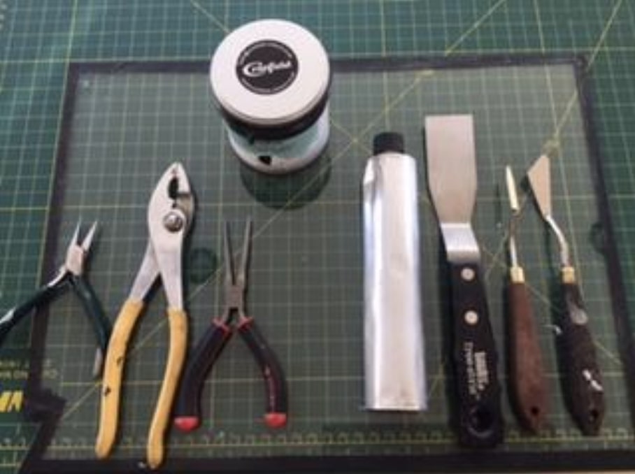
Tools (fig.1)
Dry pigment (in this case, Quinacridone Magenta PR122)
A glass muller
Thick plate glass (I use a 6mm thickness)
Linseed oil. I used the Caligo Safe Wash Oil.
Magnesium carbonate (MgCo2)
A wetting agent such as oxgall or isopropyl alcohol
Spatulas, one large, one small
37ml tube
Pliers
Tablespoon
Dropper
Figure 1
Recipe for Magenta PR122.
A good approximation to fill a 37ml tube would be 3 tablespoons of dry pigment.
Linseed oil (see ratio quoted above)
Approximately 1/16 to 1/8 teaspoon MgCo2 per tablespoon of dry pigment.
Note: It’s a good idea to mix one tablespoon of pigment at a time. Also, if the paste is too stiff it is because too much magnesium carbonate was added. You will notice this when comes the time to clean the tools as the paste will tend to stick to the tools. Then all you need to do is add a few drops of oil when comes the time to use the paste. It is easier to add oil to a stiff paste than to add the magnesium carbonate if the paste is too oily.
Preparation of muller and glass plate.
The glass muller comes with a rough flat bottom but needs to be made even rougher. Also, the glass plate needs to be sandedso that it is slightly pitted. The muller comes (if purchased from Kama Pigments) with an 80 grit silicon carbide. Spread this grit on the glass plate and add water. Take the muller and rub it against the grit on the glass plate. (It does make an awful noise). This will roughen both the muller and the glass and will create resistance as the pigment mixture is mulled against the glass. (Fig.2)
Figure 2
Figure 3
Instructions
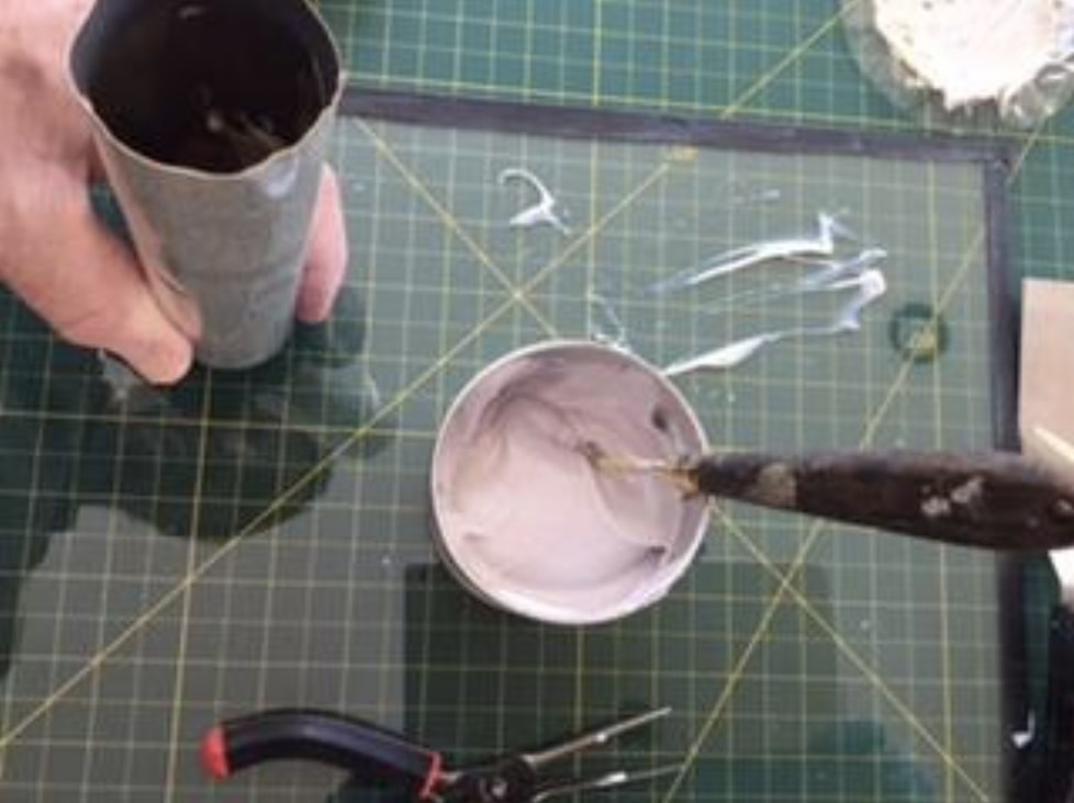
Measure the dry pigment on the glass plate (fig.3). With a dropper, start adding a wetting agent such as oxgall or alcohol to the dry pigment; using a small spatula work the mixture until all the pigments and wetting agent form a paste (fig.4). This step is important in order to break the surface tension of the pigment particles and to allow the particles to better absorb the oil.
Slowly start adding the oil to the paste. I use a dropper for this. At this point, start using a large spatula and start working the mixture carefully blending the oil into the paste. The idea is to obtain a smooth paste. Continue adding oil until the mixture is easily spreadable but not too oily. (Fig. 5).
Figure 4
Figure 5
At this point, spread the mixture on the glass plate and start using the muller. Push the muller firmly on the glass plate using a circular movement in the shape of an 8 (fig. 6). Do this for approximately 20 minutes, adding oil if necessary. The bottom part of the muller will gather the mixture along its edges; using the small spatula, remove this paste and reintegrate it to the mixture on the plate. You also need to take the large spatula and frequently gather the mixture which has by now spread over the surface of the glass plate and reposition it in the middle of the plate. Start the process all over again until you feel that the mixture is nice and smooth with no visible dry pigment. The time necessary for a perfectly milled mixture is a function of the shape and size of the particle as explained above.
Figure 6
At this point you can set the muller aside after removing all paste underneath and along its edges. Now is the time to start adding the magnesium carbonate. The magnesium carbonate will make the ink sticky so you only need small quantities. Otherwise you will find that it is very difficult to wash off as it sticks to all the tools. You will be using a small spatula to mix the carbonate into the paste. Work it in well. You want a peak but not a stiff peak (fig.7). Your ink is now ready.
Figure 7
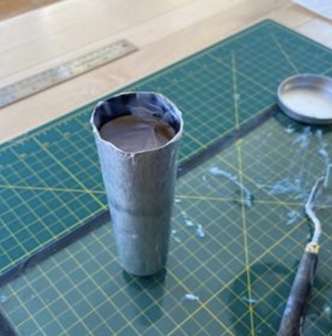
Start filling the tube with a small spatula. Hold the tube vertically, with the cap down and slightly unscrewed, As you fill the tube, you need to wrap your fingers around the tube and delicately make a downward movement, hitting a table with the bottom part of your hand so that the ink starts moving down the tube. Try not to tap down on the cap; you don’t want to damage it.
Never fill the tube to the end as you will need to leave some space to pinch the open ends together. Filling approximately 2/3 and a bit more should be about right. Pinch the open ends together using the pliers and fold the ends twice. You may want to put a piece of paper between the metal of the tube and the pliers to avoid damaging the metal.
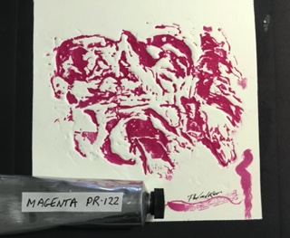
You now have a perfectly good tube of hand milled inkas used in the print (fig.8). The black border was a mixture of the magenta and phthalo green. The squiggles on the bottom right of the photo were made with the magenta heavily diluted with a plant-based diluent from Wallace Seymour which can be used to retouch a print.
Figure 8
Tools and pigment were purchased from Kama Pigments in Montreal.
The oil measurements were obtained from Ralph Mayer, The Artist’s Handbook of Materials and Techniques.
There are a few reasons why one would want to transfer ink from a can to a tube.
The hassle of opening a can and dealing with removing the numerous covers.
The ink has dried and you have to remove the top layer.
You can’t find the right colour in a small tube, like ultramarine.
You want to make your own ink and you need to store it.
The considerable cost savings in buying the larger format.
The ease in transporting tubes as opposed to cans.
Certain colours are out of stock in the smaller tubes, but available in the can.
You use a lot of certain colours, such as white, black, primary colors and of course the extender.
You want to stock up before the next pandemic in case production comes to a halt again.
Cans are messy.
Fig. 1
Here are the tools that you need (Fig. 1). It is really easy and not messy at all.
A glass plate for the mixing
A large spatula
A rubber spatula
A smaller spatula
An empty tube (tube sizes are 37 ml and 125 ml. The tubes are available at Select Fine Arts on St Joseph Blvd in Orleans or directly from Kama Pigments in Montreal)
A pair of pliers
A good blade to clean up
Pull out a good amount of ink from the can onto your glass plate.
Work the ink with a large spatula to soften it if it is too stiff.
Loosen the cap to allow the ink to move down the tube more easily.
Turn the tube upside down; take the small spatula and start filling the tube (Fig. 2)
Fig. 2Fig. 3
After each fill, tap the tube on the glass plate to help move the ink down the tube.
Continue filling the tube, constantly taping the cap lightly on the glass plate.
Fill the tube until it is about 2/3 full and start checking that you do not overfill (Fig. 3). You need the space towards the end to be able to shut the tube with your pliers.
Slowly start pressing down on the last 1/3 of the tube making sure that the ink doesn’t overflow.
Take your pliers and squeeze the ends together (Fig. 4)
Fig. 4
Fold the ends twice and squeeze tight.
Take the rubber spatula and clean the inside walls of the can.
Replace the many covers on the ink in the can.
The contents of the can will fill a large 125 ml tube, with enough left over to fill a 37 ml tube (Fig. 5).
The second stop for this exciting touring exhibition is at the Maison des arts in Saint-Faustin. Take a beautiful fall ride through the Laurentians and you can see 14 prints created with a steamroller!
In 2020 6 members of the OGPC, Tina Petrovicz, Valerie Bridgeman, Susan Cartwright, Laurence Finet, Dale Shutt and Louis Guay along with Rob Hinchley participated in the Steamroller printing event in Shawville, QC.
The theme of the exhibition is interconnection, with each artist exploring different aspects of our interconnection to the present and the past, our families and our communities, our environment and our world . The exhibition includes a video of the printing day by Glen Hartle.
The exhibition is from Sept 18th to Nov 13th, 2021. The gallery is open Wednesday to Sunday 11 AM to 5 PM. Please note masks are required indoors like all public places. For more information about Maison des arts Saint-Faustin visit their website.
sur la route
Le deuxième arrêt de cette excitante exposition itinérante est à la Maison des arts de Saint-Faustin. Faites une belle promenade automnale à travers Laurentides et vous pourrez voir 14 estampes créées avec un rouleau compresseur !
En 2020, 6 membres de l’OGPC, Tina Petrovicz, Valerie Bridgeman, Susan Cartwright, Laurence Finet, Dale Shutt et Louis Guay ainsi que Rob Hinchley ont participé à l’événement d’impression au rouleau compresseur à Shawville, QC.
Le thème de l’exposition est l’interconnexion, chaque artiste explorant différents aspects de notre interconnexion avec le présent et le passé, nos familles et nos communautés, notre environnement et notre monde. L’exposition inclus un montage vidéo de Glen Hartle.
L’exposition est du 18 septembre au 13 novembre, 2021. Heures d’ouverture est mercredi au dimanche 11h à 17h. Veuillez noter que le port du masque est obligatoire à l’intérieur comme dans tous les lieux publics. Pour plus d’informations sur la Maison des arts Saint-Faustin, visitez leur site web.
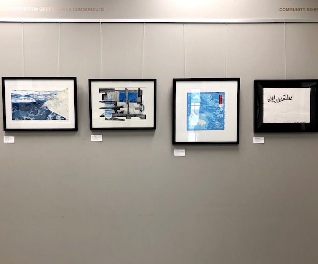
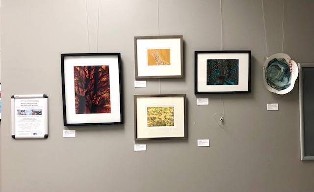
Our online show is now exhibiting at the Ottawa-Gatineau Printmakers Connective Gallery at the Nepean Creative Arts Centre in Bells Corners. Thanks to Susan Cartwright, our guest curator and all the members who helped in various capacities. The exhibit will be on display from Aug 5 to Nov 4, 2021. Call ahead to make sure you can access the space, as with this may change at short notice.
Vous pouvez maintenant voir “Messages mixtes” en personne !
Vous pouvez maintenant visiter en personne notre exposition ” Messages mixtes” à la Galerie du Collectif d’artistes-graveurs d’Ottawa-Gatineau, située au Centre des arts créatifs de Nepean (CACN) à Bells Corners. Merci à Susan Cartwright, notre commissaire invitée, et aux membres participants pour leur aide avec diverses tâches. L’exposition se déroule du 5 août au 4 novembre 2021. Il est recommandé d’appeler la réception du CACN en avance afin de vérifier que le Centre sera ouvert lors de votre visite, car les heures d’ouverture peuvent changer.
Participating printmaking artists:/ Des artistes-gravures participants(es): Luigina Baratoo, Cheryl Ann Beillard, Susan Cartwright, Murray Dineen, Peter Dolan, Deidre Hierlihy, Aileen Leo, Tina Petrovicz, Shealagh Pope, Rod Restivo, Madeleine Rousseau, Beth Shepherd, Dale Shutt, Katherine Stauble, Moira Toomey, Anamaria Gomez Upegui, Doug Williams
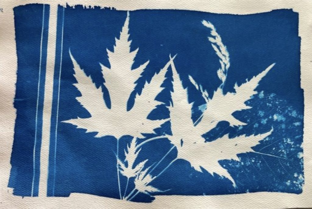
Cyanotype is a photographic printing process that produces a cyan-blue contact print through ultraviolet (UV) light exposure. Engineers used the process well into the 20th century as a simple and low-cost process to produce copies of drawings, referred to as blueprints. The process uses two chemicals:
Neither of these chemicals are carcinogens (i.e. they do not cause cancer), nor are they poisons. Rather, they are irritants. They can itch if splashed on your skin in concentration. They will also irritate your eyes. Under normal usage, cyanotype is purportedly one of the safest of all of the chemical photographic processes.
Wallacks, Deserres, and Galaxy Photo all carry cyanotype kits and chemicals but have been having trouble keeping them in stock. You also can buy paper pre-coated for cyanotypes. https://www.artnews.com/art-news/product-recommendations/best-cyanotype-paper-1234570046/ Or you can get the chemicals and apply them to the paper (or fabric) of your choice. You need to use a paper that can take being wetted and soaked.
Printmaking paper (e.g. Legion Revere, Stonehenge, BFK Rives) work. One advantage of applying the chemicals yourself is that you can brush the solution onto the paper in a pattern. You don’t have to cover the whole sheet of paper in an even field if you don’t want to.
Mixing the chemicals and prepping paper. In subdued lighting, mix equal parts Ferric Ammonium Citrate and Potassium ferricyanide to create the cyanotype sensitizer. Mix only the amount you immediately need, as the sensitizer is stable just 2-4 hours. 200ml of working (mixed) solution is enough to coat roughly 50 A4 sheets.
The paper should be coated away from sunlight. Tungsten light, as found in older lightbulbs, is fine. Paper may be double-coated for denser prints. A foam brush will give you a nice even coat. Leave an untreated border around each page so that you can handle the page without touching the chemicals. (Fingerprints or damp fingertips on the treated paper could affect the image.)
Allow to air dry in the dark. Best to dry flat or the solution drips and pools.
The paper can be prepped and stored in a light-blocking bag or box for up to six months. A heavy black plastic garbage bag (e.g. contractor grade) should work.
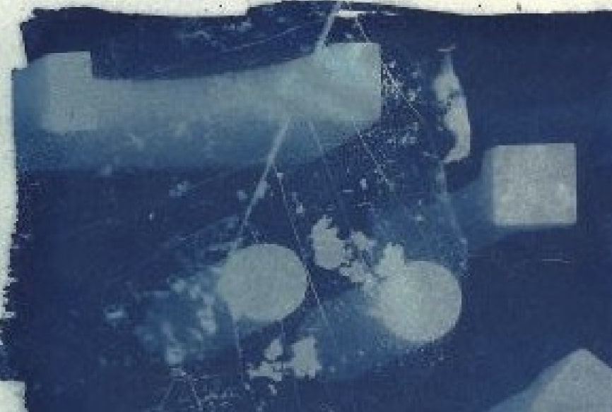
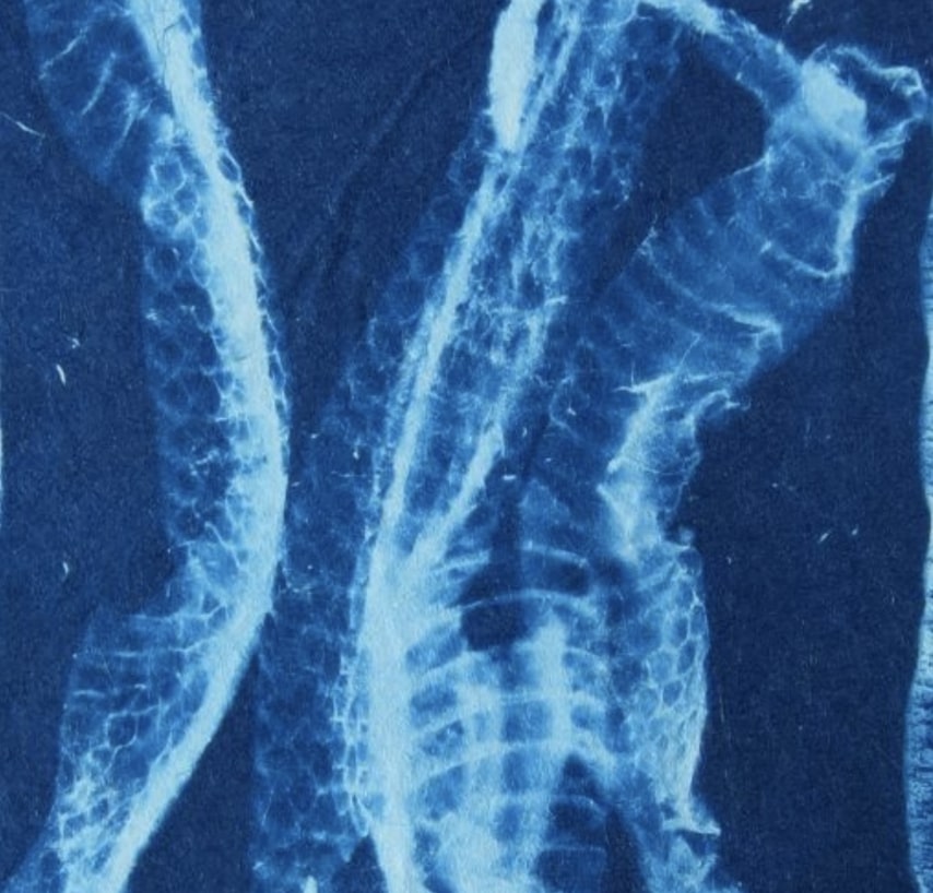
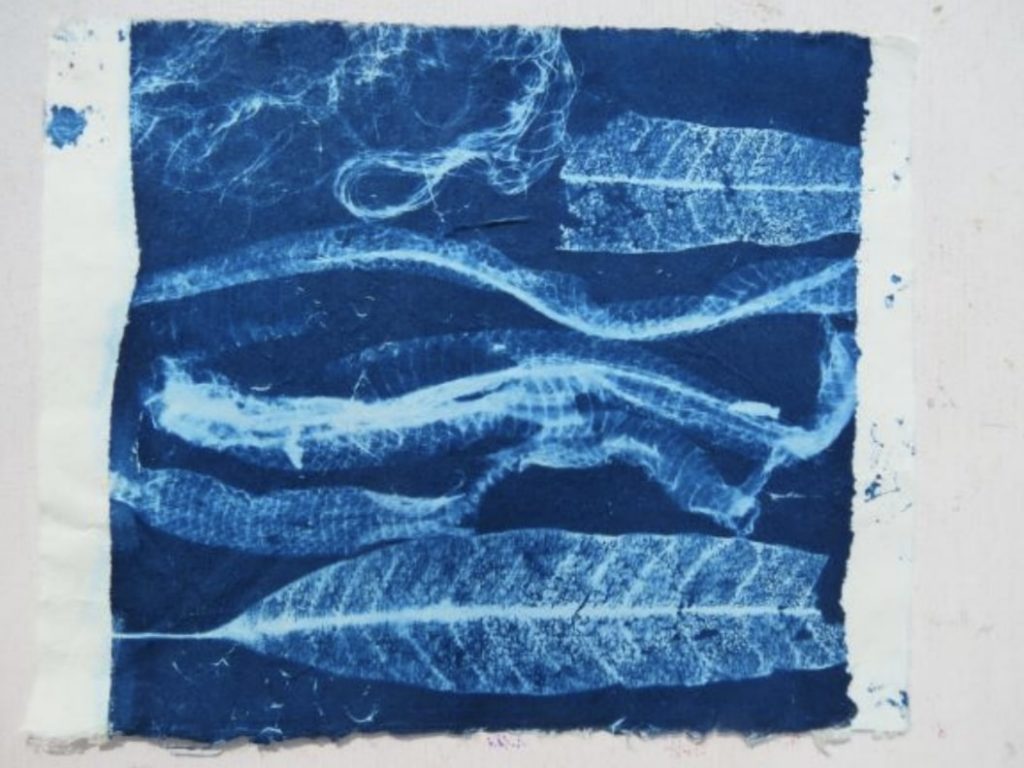
Selecting items for your image. Anything that blocks light – fully or in part – can be used to make a cyanotype. Spots where the light is prevented from reaching the paper will appear as white, once the paper is rinsed.
photos courtesy of Shealagh Pope
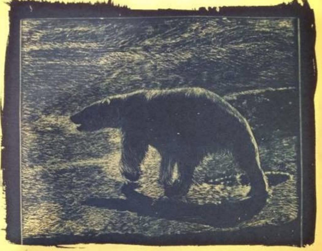
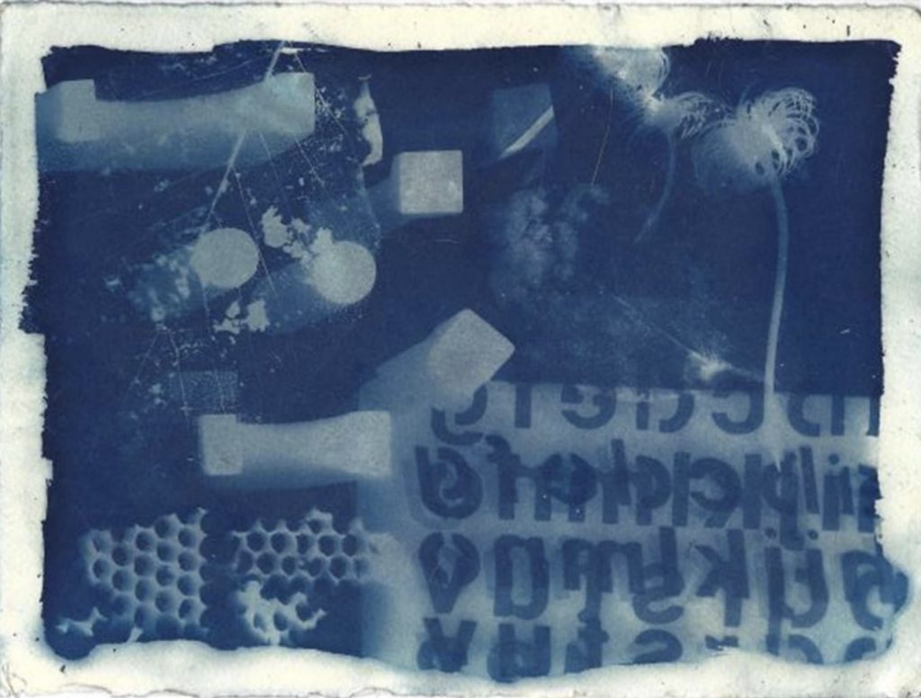
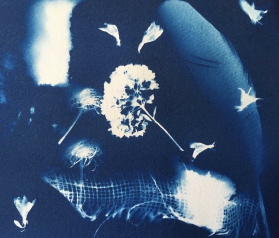
Solid objects – such as a block or a pebble – work like a stencil. Translucent objects will create a graduated impression such as the snakeskin that Val Bridgeman used (left). Taller objects, such as the children’s blocks in Deidre Hierlihy’s print on the right, can cast a graduated “shadow”. Leaves and flowers can produce both solid white and graduated blues depending on their thickness and distance from the paper. A photographic image can be created by printing a negative onto a clear acetate and using the acetate to block the sunlight. Photoshop can be used to make the negative or try http://www.jacquardsolarfast.com/ You also can draw on an acetate, or make a monotype, or use an inked drypoint to produce your cyanotype (see polar bear below printed by Shealagh Pope from a drypoint plate).
Photo courtesy of Shealagh Pope
Exposing the image. Arrange items to print on the treated paper. Place a piece of glass or acrylic on top to keep objects or negatives flush and to keep them from moving during exposure. You may also use pins, magnets, tape, a printing frame, etc. to secure the film during exposure – although any object that is placed directly on the treated paper or that casts a shadow onto it will create a image on the final print.
Check the thrift store for old picture frames from which you can remove the glass. If you use plexiglas, make sure to peel off the protective coating – as this can block the UV needed to make the image.
For the crispest image, the items to form the image should be pressed as tightly as possible against the treated paper. If using an acetate negative, place the ink side against the treated paper. In the case of the drypoint above, plastic wrap was stretched taut over the inked plate so that the inked side could be placed in contact with the treated paper without transferring ink.
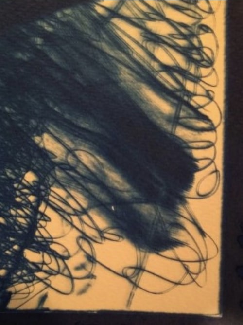
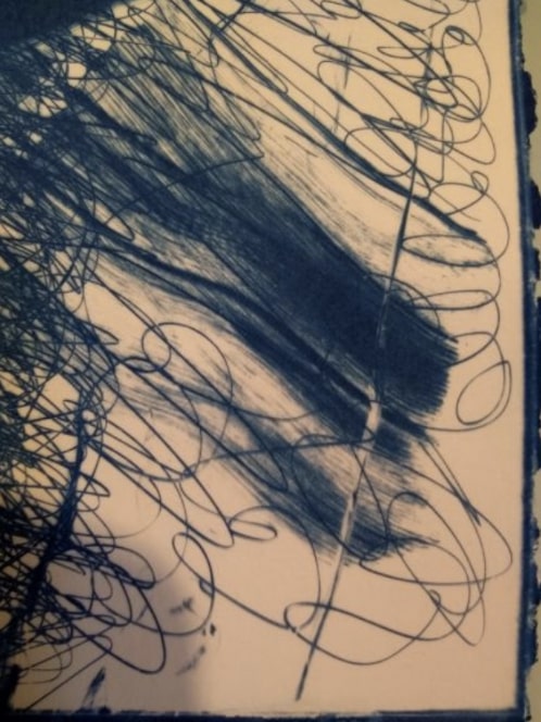
Monotype printed at 4 pmMonotype printed at noonPhotos courtesy of Shealagh Pope
Make exposures in sunlight (1-30 minutes, depending on conditions) or under a UV light source. (Note: Over-exposure is almost always preferred to under-exposure.) For a sharp image, the light source should be perpendicular to the paper. If the sun is your lightsource, exposures at the beginning and end of the day may produce fuzzy images. See images above both printed from the same monotype plate. Note that the ink was on the top side of the plate and, therefore, not in contact with the paper.
Do not wet paper before or during exposure. (Unless you are planning to play with wet cyanotype – a whole other day’s worth of experimenting!) Make sure your hands, the treated paper, and the object(s) are dry when handling the sensitized paper. The print may become splotchy if you touch it with damp hands. Sometime leaves or design elements can produce moisture during exposure. You may also have splashed or dripped on the print prior to washing.
The exposed part of the paper will turn a pale bronze colour. This will let you know the print is ready to wash.
Photo courtesy of Shealagh Pope
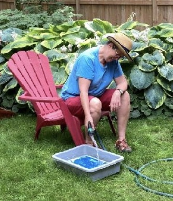
Fixing the image. Process prints in a tray or bucket of cool water. Make sure when you submerge the print in water, you do so swiftly and without splashing. Wash for at least 5 minutes, changing the water periodically, until the water runs clear. Do not use soap. With wetting, the print will change from a bronze to blue colour.
To instantly process prints to the final deep blue color, submerge washed prints in a dilute solution of hydrogen peroxide, then rinse.
Air-dry the prints on a clean clothesline or on newsprint or blotting paper. Dry away from direct sun. If peroxide was not used, prints will slowly oxidize to their final, deep blue color over the course of about 24 hours. If the print darkens during drying, it was probably not thoroughly washed.
If you do not have water to hand, place your exposed paper back in a lightfast bag or box to wash later. (Useful if you take your paper into the field for plein-air cyanotype!)
• Mold growth may occur in the Ferric Ammonium Citrate (dark green) solution over time. This will not affect the performance of the chemistry. Skim off any mold or decant the solution through a coffee filter before use.
• Sensitized paper or fabric may be stockpiled and stored. Use within 6 months for best results. Store in a cool, dry environment, preferably in a sealed bag to avoid oxidation.
• Coated paper and fabric may darken over time. If it appears dark, it is not necessarily expired; test it—it may just require a longer rinse in hotter water.
• Cyanotype prints are archival. However, yellowing may occur if prints are exposed to phosphates or high pH solutions. Cyanotype printed fabrics should always be laundered in cold water using non-phosphate detergents. Use care while handling cyano-type prints, as sweat and hand oils may also cause discoloration.
PUTTING IT ALL INTO PRACTICE
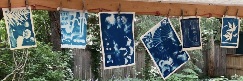
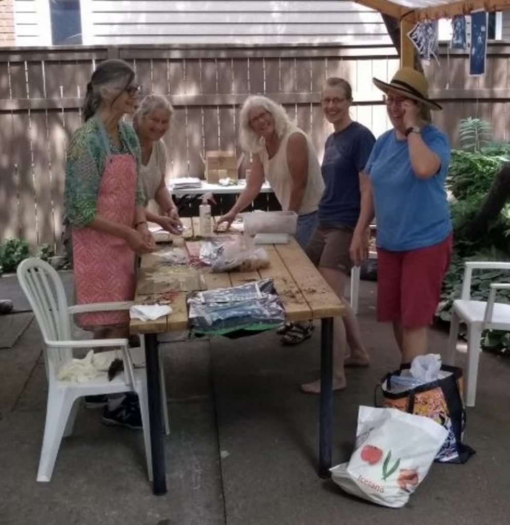
Deidre Hierlihy, Val Bridgeman, Luigina B, Shealagh Pope, and Katherine Stauble got together IN REAL LIFE to try out cyanotypes. Below is some of the output from a very fun and productive morning.
Group activity Photo courtesy of Shealagh PopeVal Bridgeman -Leaves and Snake SkinDeidre Hierlihy -blocks, stencil, honeycomb, leaf skeleton, clematisKatherine Stauble -flowers, burlap, featherLuigina Baratto – leaves, grass, leaf skeleton, ribbon
In 2020 6 members of the OGPC, Tina Petrovicz, Valerie Bridgeman, Susan Cartwright, Laurence Finet, Dale Shutt and Louis Guay along with Rob Hinchley participated in the Steamroller printing event in Shawville, QC. Now the 14 prints they created are going on the road! The first stop for this exciting touring exhibit will be at the Stone School Gallery in Portage du Fort.
The theme of the exhibit is interconnection, with each artist exploring different aspects of our interconnection to nature, the environment, our community, our history and one another . The exhibit includes a video of the printing day.
The Vernissage is Friday June 11th, 2021. The show runs June 12th to July 11th. Please note masks are required indoors like all public places. Safety precautions will be in place and no more than 25 people will be allowed in the building at a time in accordance with local health authority rules.
sur la route
En 2020, 6 membres du CAGOG, Tina Petrovicz, Valerie Bridgeman, Susan Cartwright, Laurence Finet, Dale Shutt et Louis Guay ainsi que Rob Hinchley ont participé à l’événement d’impression Steamroller à Shawville, QC. Les 14 tirages qu’ils ont créés partent maintenant en tournée ! Le premier arrêt de cette passionnante exposition itinérante se fera au Galerie de l’école en pierre, à Portage-du-Fort, QC.
Le thème de l’exposition est l’interconnexion, chaque artiste explorant différents aspects de notre interconnexion avec la nature, l’environnement, notre communauté, notre histoire et les autres. L’exposition comprend une vidéo de la journée d’impression.
Le vernissage aura lieu le vendredi 11 juin 2021. L’exposition se déroule du 12 juin au 11 juillet. Veuillez noter que les masques sont obligatoires à l’intérieur comme dans tous les lieux publics. Des mesures de sécurité seront mises en place et pas plus de 25 personnes ne seront autorisées dans le bâtiment à la fois, conformément aux règles des autorités sanitaires locales.
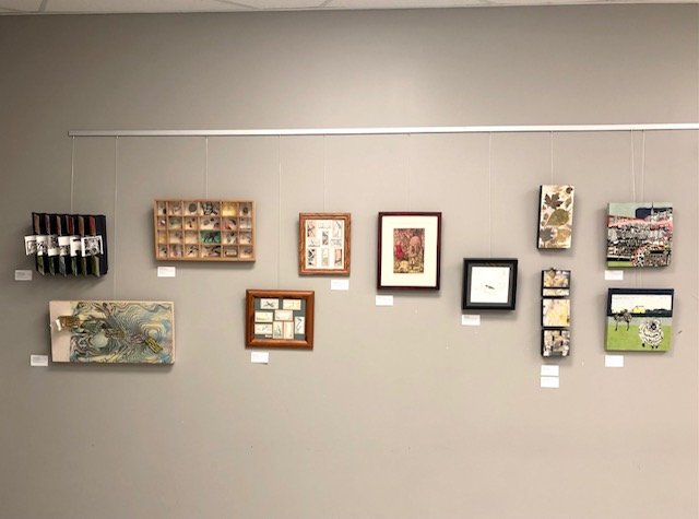
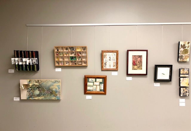
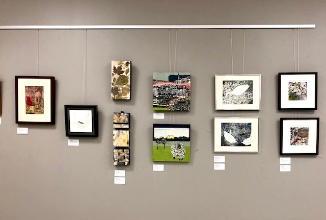
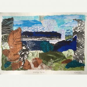
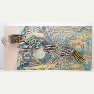
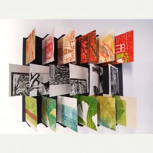
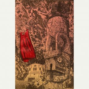
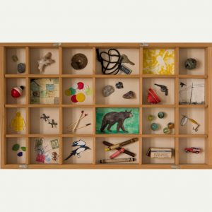
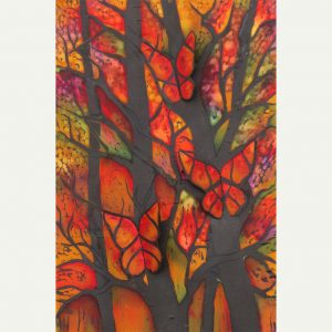
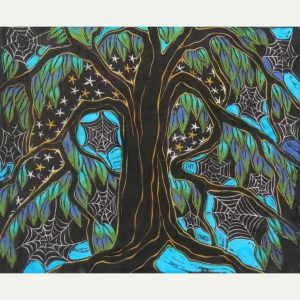
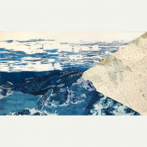
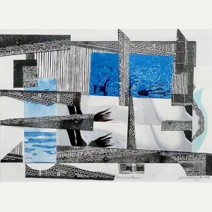
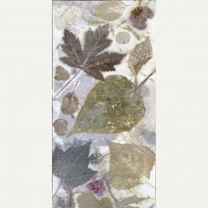
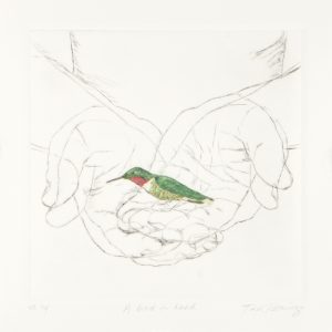
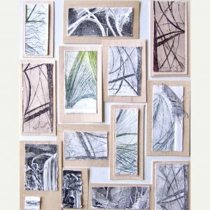
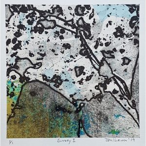
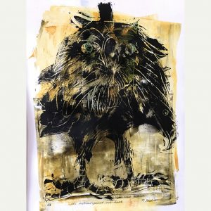
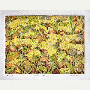
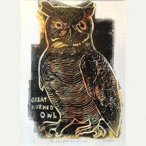
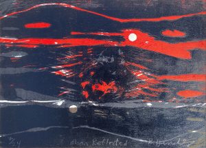
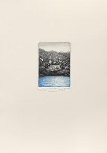
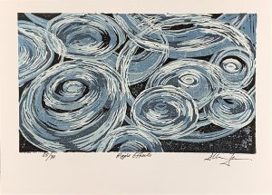
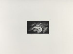
The 32 prints in this exhibition, by 17 members of the Ottawa-Gatineau Printmakers’ Connective (OGPC), offer many interesting examples of mixed media art. Some feature several printmaking media (intaglio and relief printing, for example), while others combine printmaking with drawing, painting, collage and found materials, such as maps and nautical charts.
Mixed media work offers artists the freedom to explore the impact and effect of different media in a single piece of art and to connect to viewers through a multi-layered work. For artists who wish to salvage portions of prints that for some reason were deemed unsuitable for an edition, a cropped or combined print may well render a more powerful and evocative piece.
For some artists, the formality and discipline of a print may be successfully paired with the looseness of brush strokes and gestures in paint, ink, graphite, charcoal or other drawing and painting materials, creating an inner tension that they could not have achieved with a single medium.
This exhibition, which will run online May 25th to September 16th, was curated by Susan Cartwright and Beth Shepherd, with assistance from Tina Petrovicz, Madeleine Rousseau, Katherine Stauble and Roger Sutcliffe.
Exposition virtuelle d’arts imprimés et techniques mixtes du Collectif d’artistes-graveurs d’Ottawa-Gatineau
Dix-sept membres du Collectif d’artistes-graveurs d’Ottawa-Gatineau (CAGOG) participent à cette exposition regroupant trente-deux œuvres originales qui offrent de nombreux exemples intéressants des techniques mixtes appliquées aux arts imprimés. Certains artistes font appel à plusieurs techniques d’impression telles que la gravure en creux et en relief alors que d’autres combinent les arts imprimés avec le dessin, la peinture, le collage et les objets trouvés, comme des cartes et des graphiques nautiques.
Travailler en techniques mixtes offre aux artistes la liberté d’explorer l’impact et l’effet de divers arts visuels en une seule œuvre d’art et de rejoindre le public par le biais d’une œuvre à plusieurs niveaux. Les artistes-graveurs produisent des épreuves d’estampes qui, pour une raison ou une autre, ne font pas partie d’une édition. Celles-ci peuvent être retravaillées, par un cadrage différent ou un montage par exemple pour devenir des oeuvres plus puissantes et évocatrices.
Pour certains artistes, la formalité et la discipline associées à la création d’estampes se jumellent bien à la souplesse des coups de pinceau et à la gestuelle propre à la peinture, l’encre, le graphite, le fusain ou d’autres matériaux de dessin et de peinture. Il en résulte une tension intrinsèque impossible à créer avec un seul médium.
Cette exposition est organisée par Susan Cartwright et Beth Shepherd, avec l’aide de Tina Petrovicz, Madeleine Rousseau, Katherine Stauble et Roger Sutcliffe. L’exposition virtuelle se tiendra du 25 mai au 16 septembre.
Espérant que les oeuvres rassemblées ici sauront vous plaire.
Exhibiting Artists (not in order of appearance) / Les artists exposants (pas dans l’ordre d’apparition):Luigina Baratoo, Cheryl Ann Beillard, Susan Cartwright, Murray Dineen, Peter Dolan, Deidre Hierlihy, Aileen Leo, Tina Petrovicz, Shealagh Pope, Rod Restivo, Madeleine Rousseau, Beth Shepherd, Dale Shutt, Katherine Stauble, Moira Toomey, Anamaria Gomez Upegui, Doug Williams
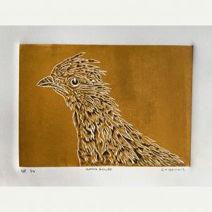
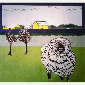
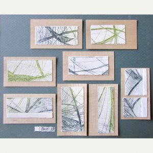
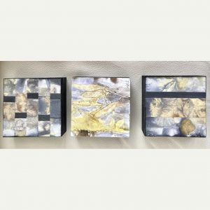
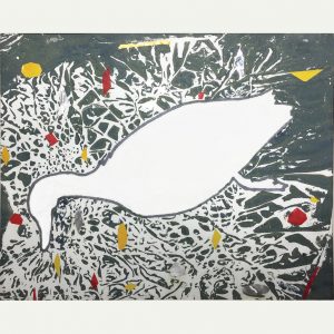
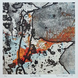
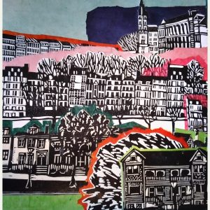
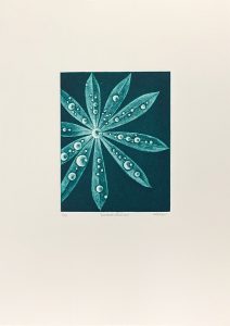
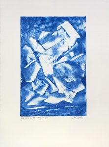
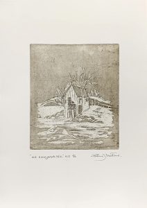
Click on the artwork to have more information and see a close-up view./ Cliquez sur l’œuvre d’art pour avoir plus d’informations et voir un gros plan.
Click on the artwork to have more information and see a close-up view./ Cliquez sur l’œuvre d’art pour avoir plus d’informations et voir un gros plan
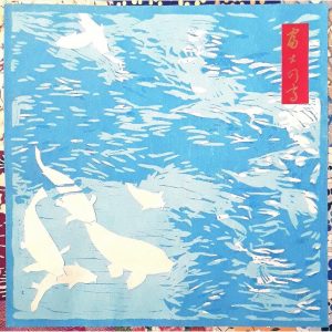
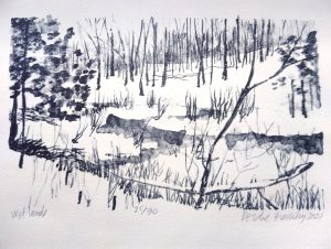
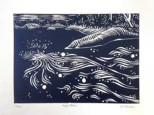
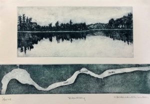
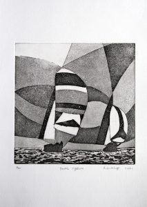
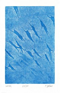
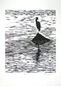
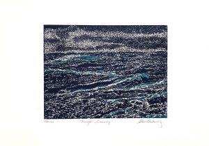
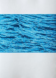
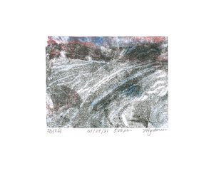
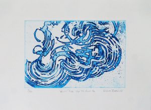
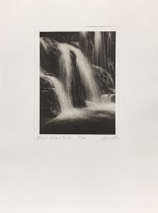
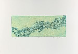
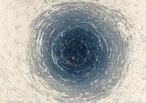
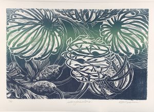
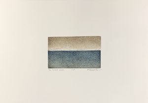
As the snow melts and the ice breaks up, we can all start to enjoy the kinds of scenes depicted in Waterworks on Paper, a collaboration between OGPC and the Mahone Bay Printmakers. On view at the Lunenburg Art Gallery, Lunenburg, NS, April 2-May 1, the 22 works demonstrate a variety of approaches to the theme of water, from figurative to abstract works, and from mezzotint to etching, relief and photogravure.
The participating OGPC artists are Mary Baranowski-Lowden, Sylvia Bretzloff, Valerie Bridgeman, Susan Cartwright, Peter Dolan, Deidre Hierlihy, Rob Hinchley, Freida Hjartarson, Katherine Stauble, Roger Sutcliffe and Shealagh Pope.
Sadly, due to the pandemic, the exhibition will no longer be on view at the Ottawa School of Art in April. Check back here for future dates.
This project is dedicated to Ed Porter, artist, sailor, kind gentleman, Prof. Emeritus NSCAD U, and founder of Mahone Bay Printmakers.
‘Waterworks on paper’ — Une exposition et échange d’estampes
À mesure que la neige fond et que la glace se brise, nous pouvons tous commencer à apprécier le genre de scènes dépeintes dans Waterworks on Paper, une collaboration entre le CAGOG et le Mahone Bay Printmakers. Exposées à la Lunenburg Art Gallery, Lunenburg, N.-É., du 2 avril au 1er mai, les 22 œuvres illustrent bien la variété d’expression visuelle du thème de l’eau, allant des œuvres figuratives aux œuvres abstraites, et de la manière noire à l’eau-forte, au relief et à la photogravure.
Les artistes participants du CAGOG sont Mary Baranowski-Lowden, Sylvia Bretzloff, Valerie Bridgeman, Susan Cartwright, Peter Dolan, Deidre Hierlihy, Rob Hinchley, Freida Hjartarson, Katherine Stauble, Roger Sutcliffe et Shealagh Pope.
Malheureusement, en raison de la pandémie, l’exposition ne pourra pas être visitée à l’École d’art d’Ottawa en avril. Revenez ici pour connaître les prochaines dates.
Ce projet est dédié à Ed Porter, artiste, marin, gentilhomme, professeur émérite de NSCAD U, et fondateur de Mahone Bay Printmakers.
Ottawa-Gatineau Printmakers Connective
To see more information and a close-up of an individual print please click on the artwork image. / Pour obtenir plus d’information et voir un gros plan d’une estampe en particulier veuillez cliquer sur l’image de l’œuvre.
Participating OGPC members (in order of appearance) / Les artistes participants de la CAGOG (en ordre de présentation) :
To see more information and a close-up of an individual print please click on the artwork image. / Pour obtenir plus d’information et voir un gros plan d’une estampe en particulier veuillez cliquer sur l’image de l’œuvre.
Participating members of Mahone Bay (in order of appearance)/ Les artistes participants de Mahone Bay (en ordre de présentation) :